Making your story tangible
Client: Transpower
With the move to new premises, Transpower saw the opportunity to use their space to engage both internal and external audiences in its story.
The brief
And they had a good story - of people, innovation, efficiency and always being there for New Zealand. The desire was for staff to feel proud and for visitors to learn something new every time they came. With existing architectural elements, multiple entry points and audiences, and the requirement for seamless integration of internal and external identities and messages, big design thinking was needed.
The solution
We started by mapping the audience journeys through the new space, understanding the opportunities to layer connected stories. Connected became the enduring design idea that linked all the spaces and stories.
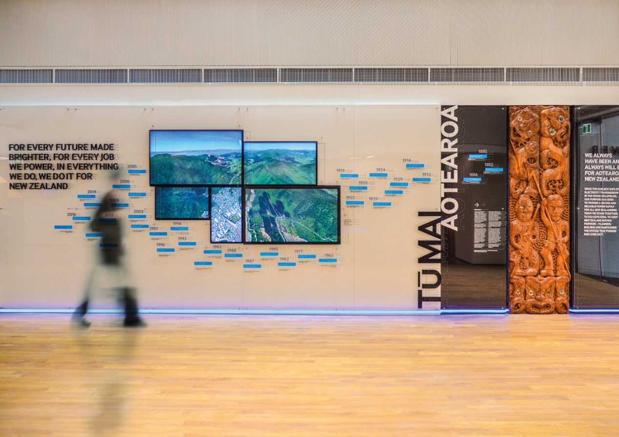
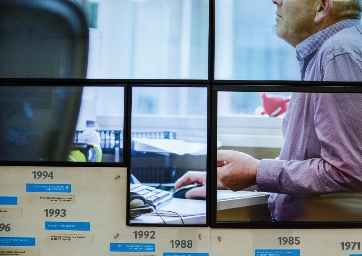
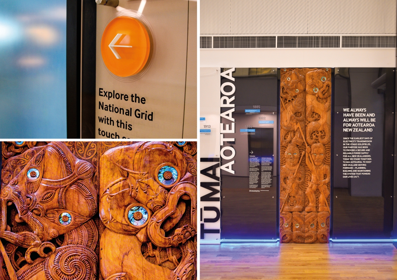
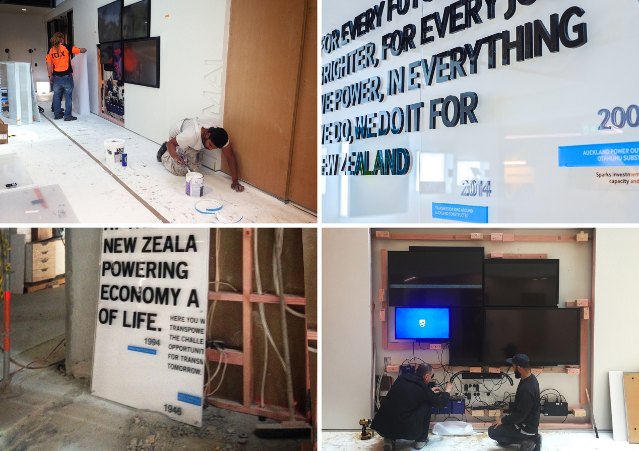
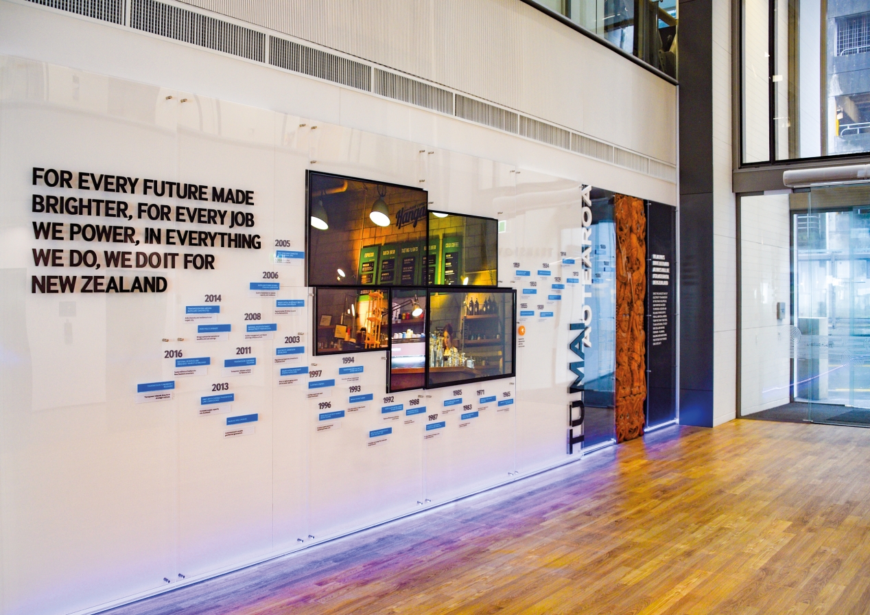
Beyond reception and the massive sign on top of the building, the hero is definitely the 8.5 x 3m heritage timeline wall. Layered clear and white perspex allows key dates and associated facts to pop out, encouraging audience interaction with the timeline. Five synced screens use video, imagery and interactivity to engage audiences. 3D text connects to a bespoke carving, representing the special relationship with Māori.
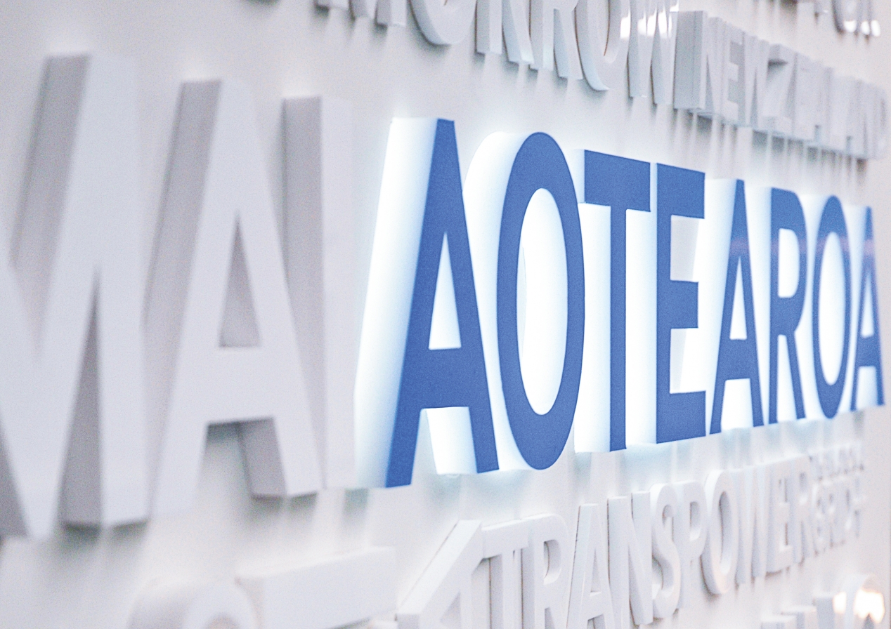
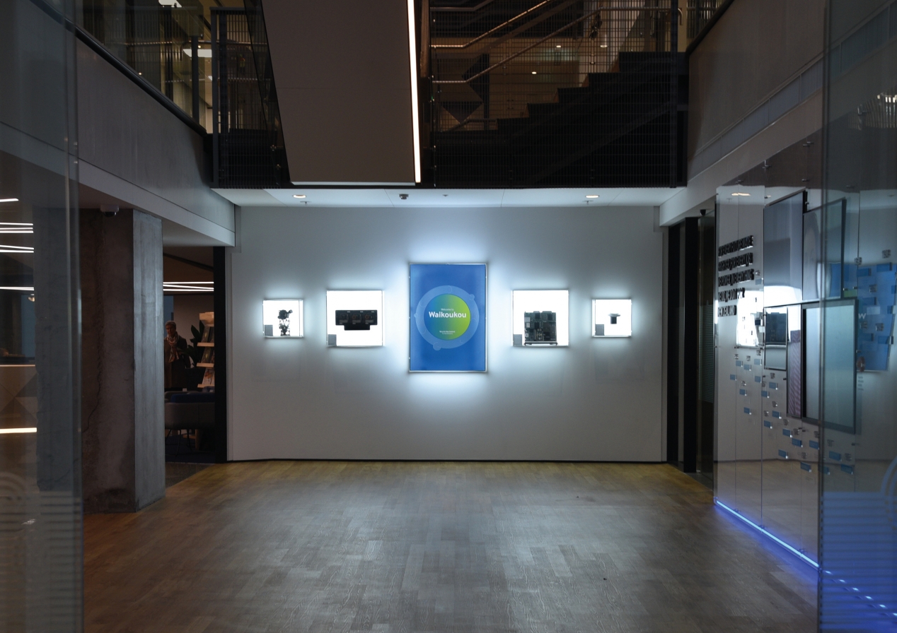
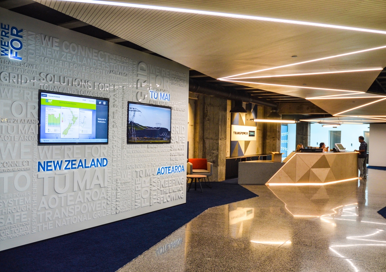
A series of lightbox display cabinets, visually aligned to the heritage wall, allow for easily changed-out artefacts and promotional displays. Blue LED kickboard strip lights guide visitors from past to present, reinforcing that Transpower has always been there. A white-on-white ‘word-find’ 3D typography wall boldly communicates core messages.
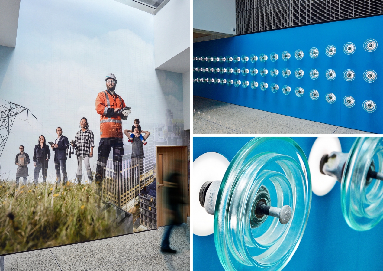
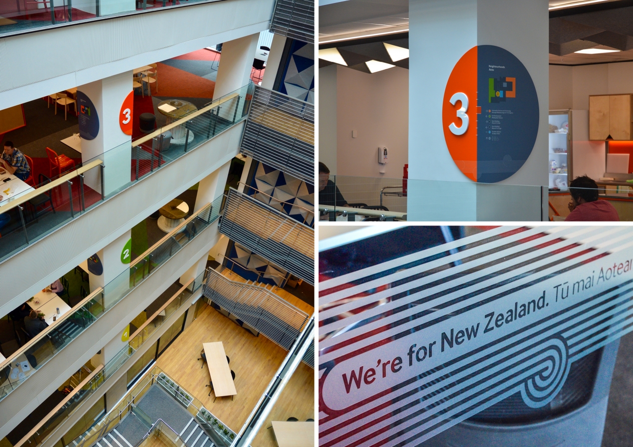
The Transpower logo informed the design of three repurposed conductor lines spanning 15m that draw visitors to reception. For the large three-storey image wall, a Transpower worker brings together a cross-section of New Zealand’s diverse community. Floor navigation and wayfinding devices connect spaces, guiding both the eye and traffic flows. The impact is most notable in the stairwell and atrium where the bright floor colours can be seen scaling all six floors.
An integrated colour, texture and graphic palette supports the connected idea, unifying the design across spaces and complementing the architectural elements. The external facing brand messaging moves effortlessly to internal messages like purpose, priorities and behaviours, and traditional print and signage techniques combine with new technologies, lighting and projection to deliver a powerful and connected storytelling experience.
The results
This was a massive 18-month effort, but watching audiences interact with the work makes it all worth it. Transpower is delighted with the result and is already extending elements of it into their other offices.
