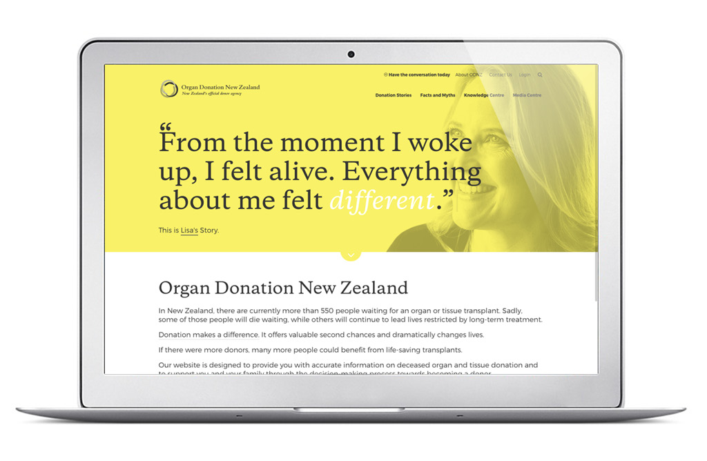
The voice of authority
Client: Organ Donation New Zealand
BRONZE: 2017 INOVA WEBSITE EXCELLENCE AWARDS
FINALIST: 2017 BEST AWARDS
Organ Donation is a subject that is prone to myths and misunderstandings.
A new website was a vital tool to educate and to provide the facts and stories to dispel the myths and help people make informed decisions.
The Brief
Having worked with Organ Donation New Zealand (ODNZ) since 2005, we had a very good understanding of the topic and the politics and communication challenges surrounding it. The opportunity to re-think their website from scratch enabled us to take a very user-centric approach to ensure a very different experience from the existing site which was awkward to navigate, difficult for finding information, short of optimal content and lacking the important human and emotional connection.
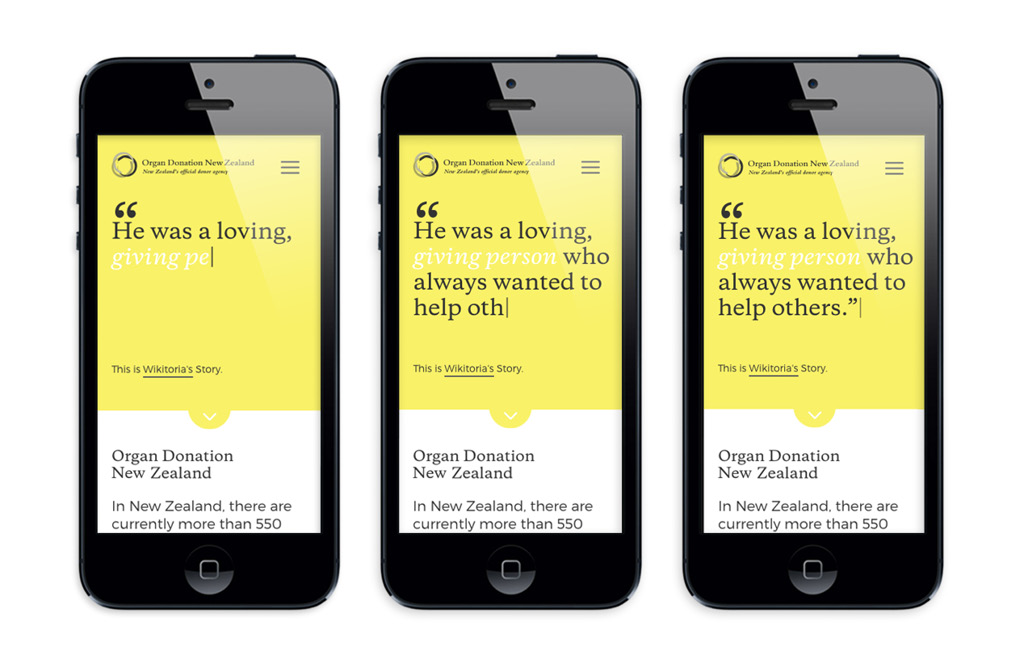
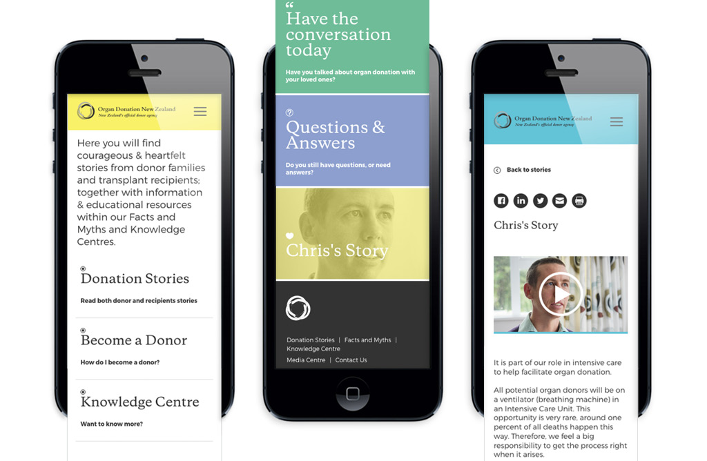
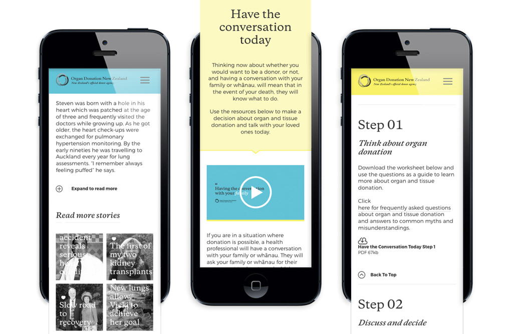
The brief was to correct these legacy issues, prepare engaging content, identify audience groups and provide clear and direct user journeys for each. From the client’s perspective, a user-friendly content management system was critical. And of course, the site needed to be responsive to be relevant in a world where over 50% of website visits are now accessed from mobile devices.
The Solution
We started with a comprehensive workshop where we explored the obvious things like identification of audience groupings and what sort of content each was seeking. But we also explored human sensitivity issues like making donor decisions at the time of a loved one’s sudden death, religious and cultural views, misunderstandings, and dispelling commonly held myths.
The core audiences we identified included:
- people looking for information on organ donation either to inform their own decision so they can advise their families or people seeking information at the time of the imminent death of a family member
- school students and educators
- media – providing the facts in order to mitigate the dissemination of flawed information
- healthcare professionals
Most important was that we approach the site with no ‘agenda’. One thing this site was not, was any form of advocate for or against organ donation. ODNZ’s firmly held view is that their role is not to promote or influence the decision whether or not to donate – purely to provide the right information to help people with that decision.
It was therefore critical that the entire tone and content of the site was as a source of facts and the one voice in the organ donation landscape that was expert, neutral, science-based and authoritative.
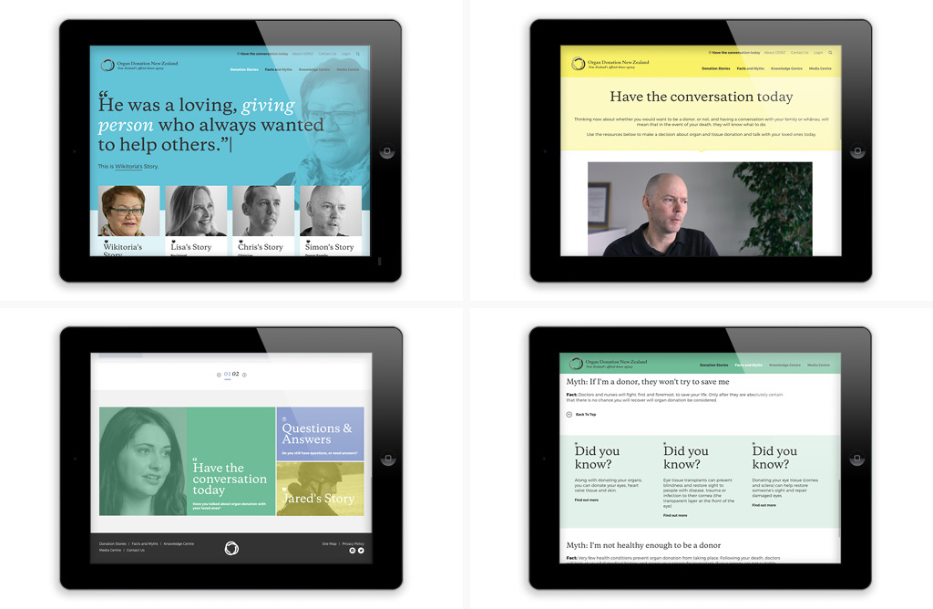
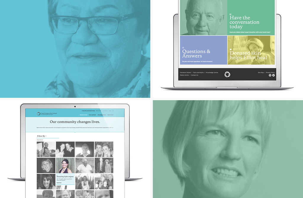
The site’s architecture clearly addresses the identified audience groups, but with a common overlay that takes a very human approach, with affected people telling their own stories, whether it be a transplant recipient whose life has changed, a family member who had to make a decision about a loved one, or an intensive care clinician who deals with families at a highly emotional time.
We elected to shoot some short videos of these people telling their stories for three communication-effectiveness reasons: it is easier for the viewer to engage with their story, the raw emotion of the decision is much clearer and instructional, and usability trends clearly show that audience expectations today are very video-focused.
Given that the purpose of the site was not to influence a decision in a particular direction, no ‘call to action’ was required. However, we felt that this would be a missed opportunity and encouraged the client to consider providing tools to help people work through their feelings and open a dialogue with their family. And so, we added a ‘Have the conversation today’ page with useful guidance materials for people to download to aid family discussions.
The Results
At the time of writing, the site has been live for two months. By comparison with the same period one year prior, home page visits are up 31%, total page views are up 17%, time spent on pages has increased by 60%, 20% more pages have been viewed per session and bounce rates have dropped by 30%.
