Drawn towards the light
Client: NZX
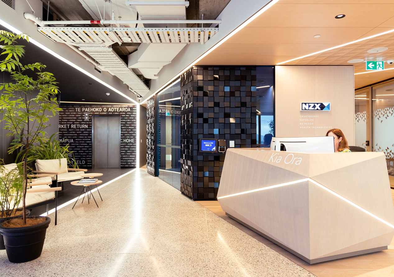
A warm and welcoming visitor experience for New Zealand's capital markets.
The Brief
For the move to their new downtown premises NZX asked us to develop a spatial experience that reflected their new Enabling Kiwi Success brand positioning and visual identity. Our scope was a warm and welcoming visitor experience in the main reception area that continues the storytelling into the staff-only areas.
The Solution
Our core creative idea was to position this place as the dynamic epicentre of New Zealand’s financial markets - a celebrated location with mana like the New York or London exchange buildings. In designing the physical space, the architects were inspired by New Zealand’s markets being the first to see the sun each day. We carried this notion of light into our own thinking, balancing the technical and structured feel of darker areas with a more innovative and human feel of lighter spaces.
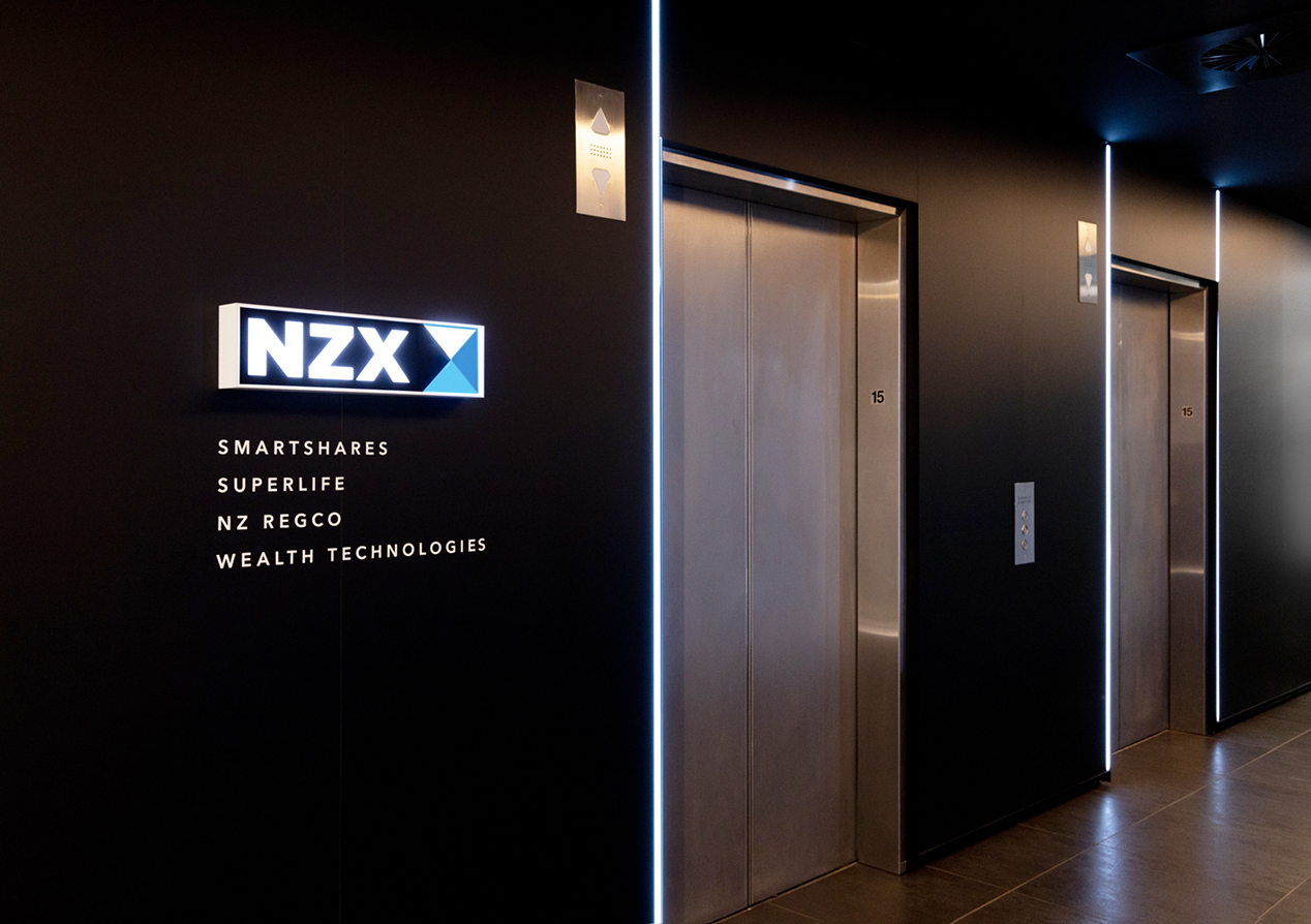
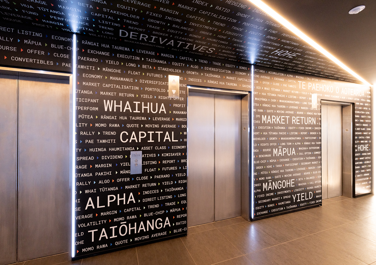
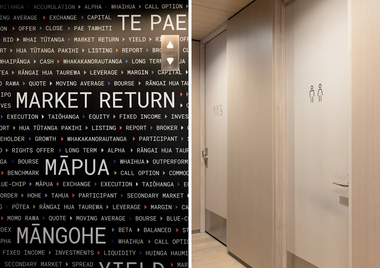
The experience starts in the lobby, with visitors exiting the lifts into a dark space dominated by typographic messaging. They find themselves immersed into a physical representation of the markets. An interplay of English and Te Reo words clearly signals New Zealand’s financial ecosystem.
From the dark, visitors are drawn towards the light emanating from the media room at the end of the corridor. Here a digital presence over-takes the physical, driven by the glow from the wall of market screens displaying real-time market movements.
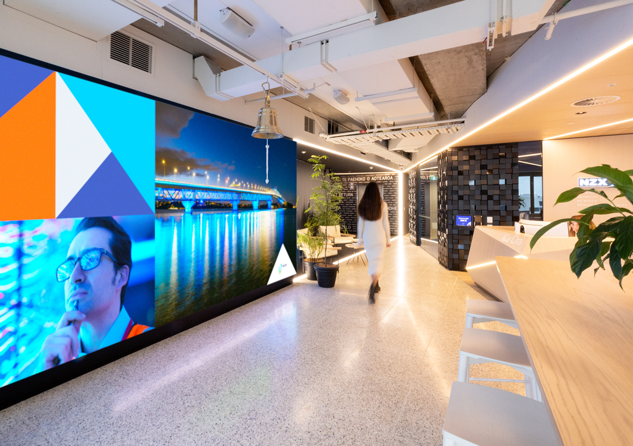
From here the visitor is again guided towards the light. First, from the windows injecting the natural light past the market-bell and into the room and then by the directional neon light tubes drawing the visitor to reception.
At reception, physical and digital co-exist once again. A natural wood desk, with an inbuilt sense of direction, welcomes visitors under the soft glow of the logo lightbox.
Beyond the iconic market-bell centrepiece, the hero of reception is the dominant screen on the front wall. The ever changing content brings energy to the space and continues the idea that this is the centre of a very dynamic world. Curated content varies between telling NZX’s enabling success story to telling stories, from and about, the companies listed on the exchange.
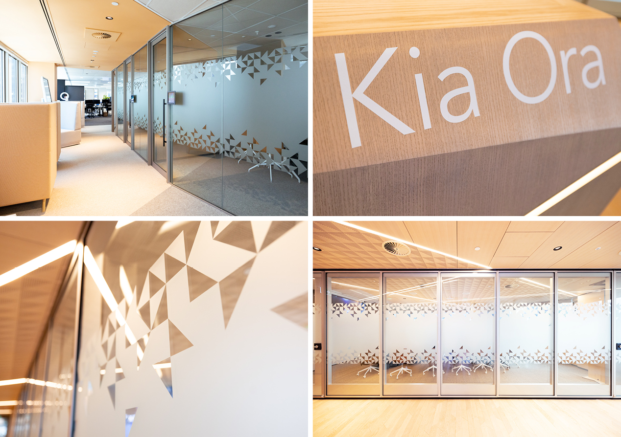
A unique frosted glass pattern, derived from the NZX brand pattern, provides privacy for meeting rooms while continuing that sense of dynamic movement. The meeting room walls open up to create a large open space for events and new listings. This created the extra design challenge of ensuring the user journey and storytelling were as strong in both the closed and open states.
Branding and wayfinding throughout the space is subtle to counterbalance the noise of the architectural fit out and to reduce distraction from the key journeys.
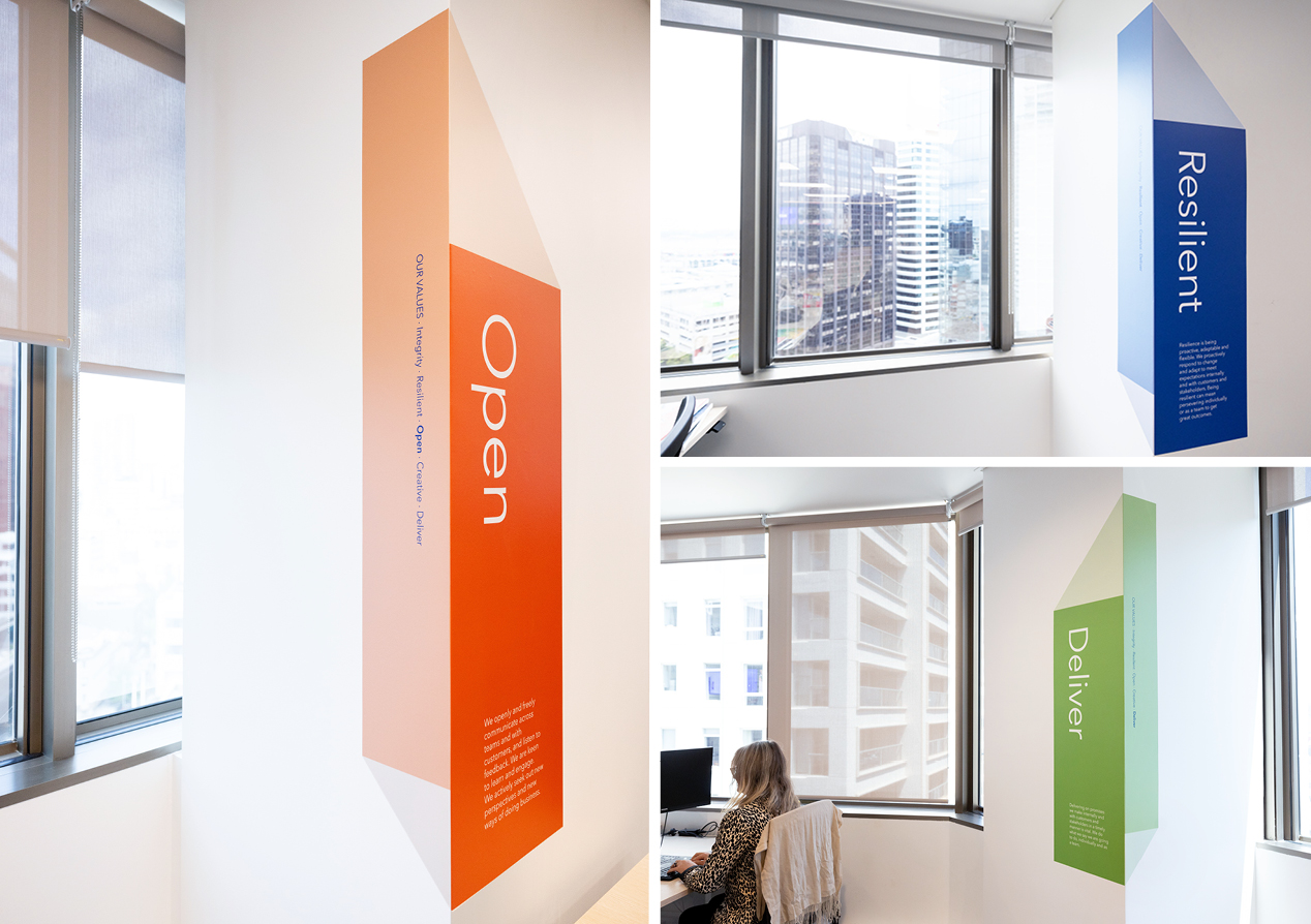
In staff areas, the focus was on reinforcing the values. Big blocks of colour, utilising a multi-dimensional variation of the brand pattern, reinforce the idea of energy, light and movement.
The Result
The client has been forthcoming with their positive praise of the office experience, noting the cohesive storytelling flow. It’s brought the brand alive and helped galvanise the team around the Enabling Kiwi Success positioning. The space has already played host to a number of new listings, adding to the sense of occasion and celebration.
