Investing for the future
Client: NZ Super Fund

The New Zealand Super Fund approached us to redesign their website.
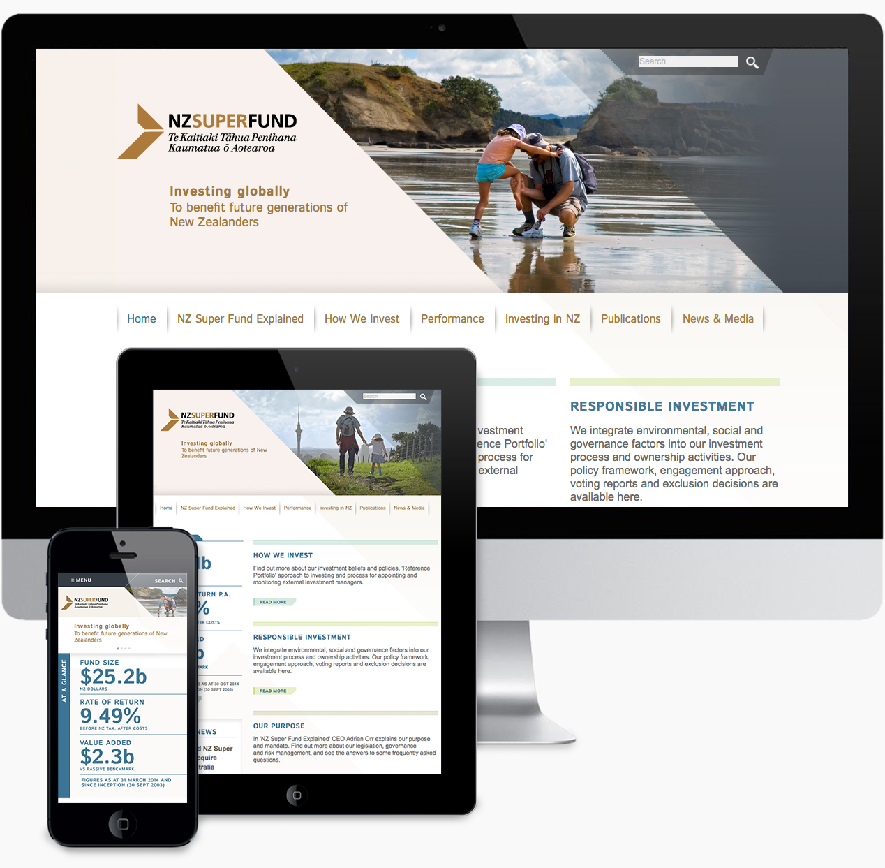
They wanted a more user-friendly, visually modern site that would be easy to manage and update via a content management system.
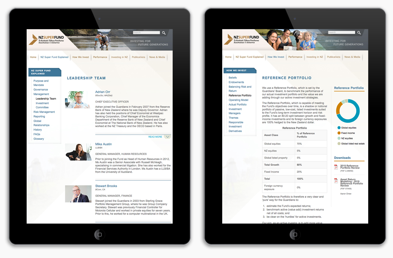
We’ve worked with the Fund for a number of years on visual identity streamlining and various offline communications, including their annual report which has achieved international recognition. The website held quite different communication challenges, speaking primarily to audiences that look to track the Fund’s performance and understand its investment approach. Working closely with the client and undertaking user testing, we refined the information architecture with a focus on user experience, aiming for ease of navigation and clarity of information across desktop, phone and tablet versions of the site.
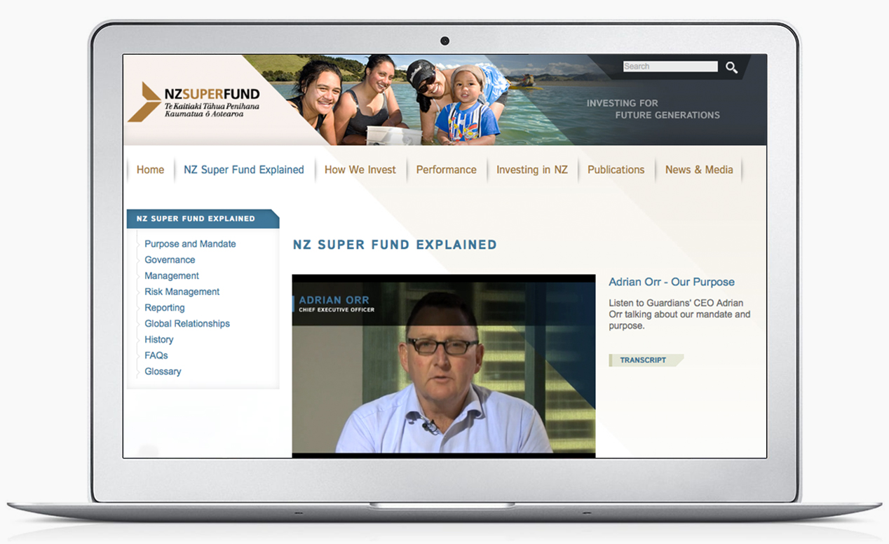
The design solution involved moving away from the previous abstract imagery to more human imagery of children, parents and grandparents interacting in natural New Zealand environments. This more effectively delivered on the inter-generational focus of the Fund – saving now to benefit future generations. Using a combination of subtle but important humanist design assets such as soft shadowing in the navigation and layered colour tones, we created a warmer experience that supports the Fund’s purpose. Rich content such as video was incorporated to explain more complex content and to put faces to the names of key members of the Super Fund team.


