Minimalist storytelling
Client: NZ Super Fund
ARA AWARDS 2022. WINNER - ARA ANNUAL REPORT OF THE YEAR.
ARA AWARDS 2022. WINNER - BEST OF FINANCIAL SERVICES SECTOR.
ARA AWARDS 2022. GOLD AWARD.
Reminding investors that there is value in volatility.
The brief
For the 2021 Guardians of NZ Superannuation Annual Report our goal was to develop a creative platform to reflect the key theme of ‘finding opportunity in crisis.’ Covid-19 continued to impact global financial markets and the NZ Super Fund performance. We needed to acknowledge the challenges while getting audiences to focus on the long term value that volatility offers.
The solution
The starting point was to develop a compelling ‘value in volatility’ narrative to resonate with investors. Volatile markets cause uncertainty and concern for many investors. For us, volatility represents opportunity. Market lows highlight undervalued assets worth investing in while market highs allow long-term value to be realised. History tells us that short-term volatility adds to long-term return. The volatile times of the last year have provided us with many excellent opportunities to invest in better long-term value for all New Zealand.
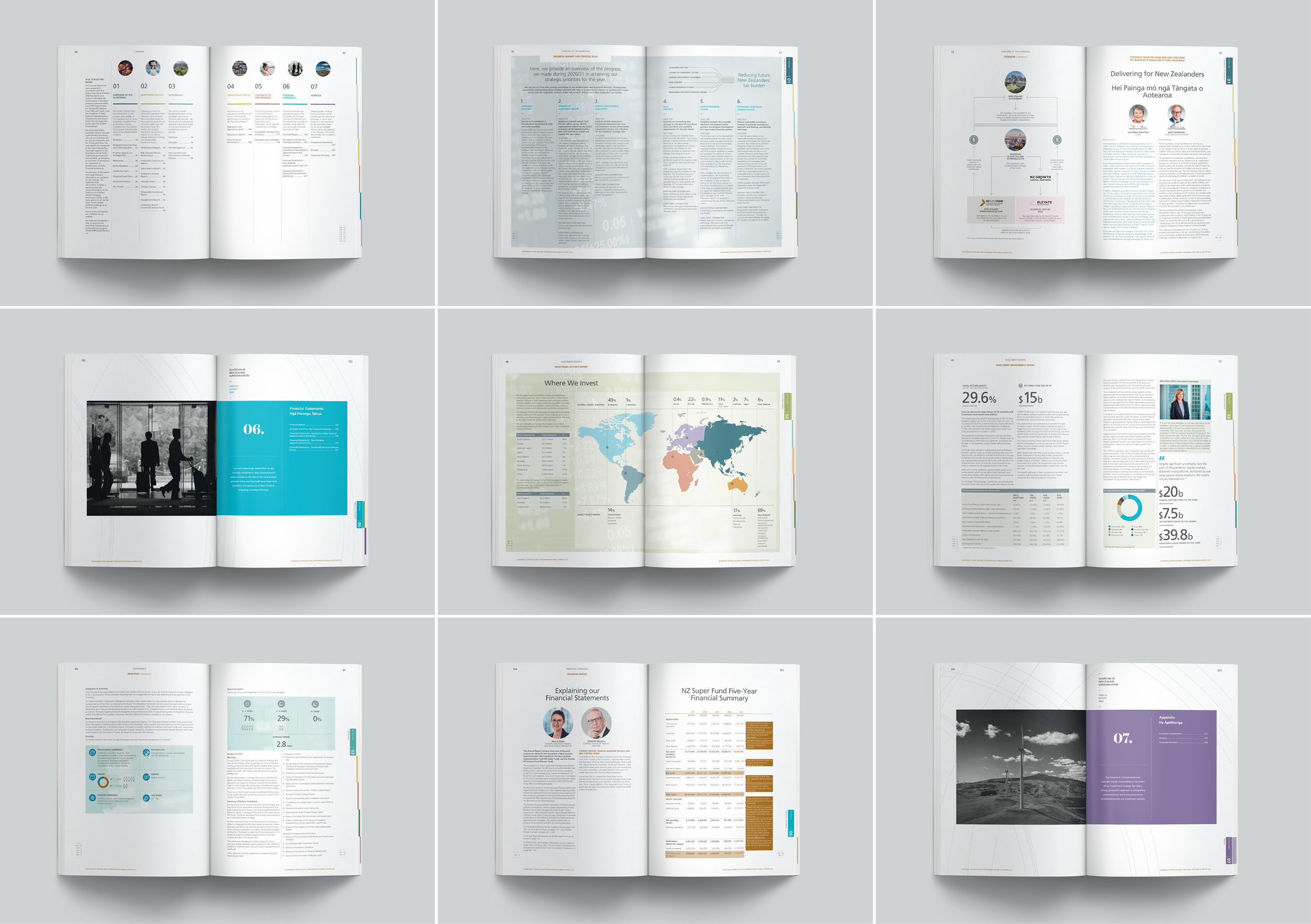
This story became the backbone for a pared-back visual language, with a focus on simple messages and imagery, that speak directly to investment markets and investors.
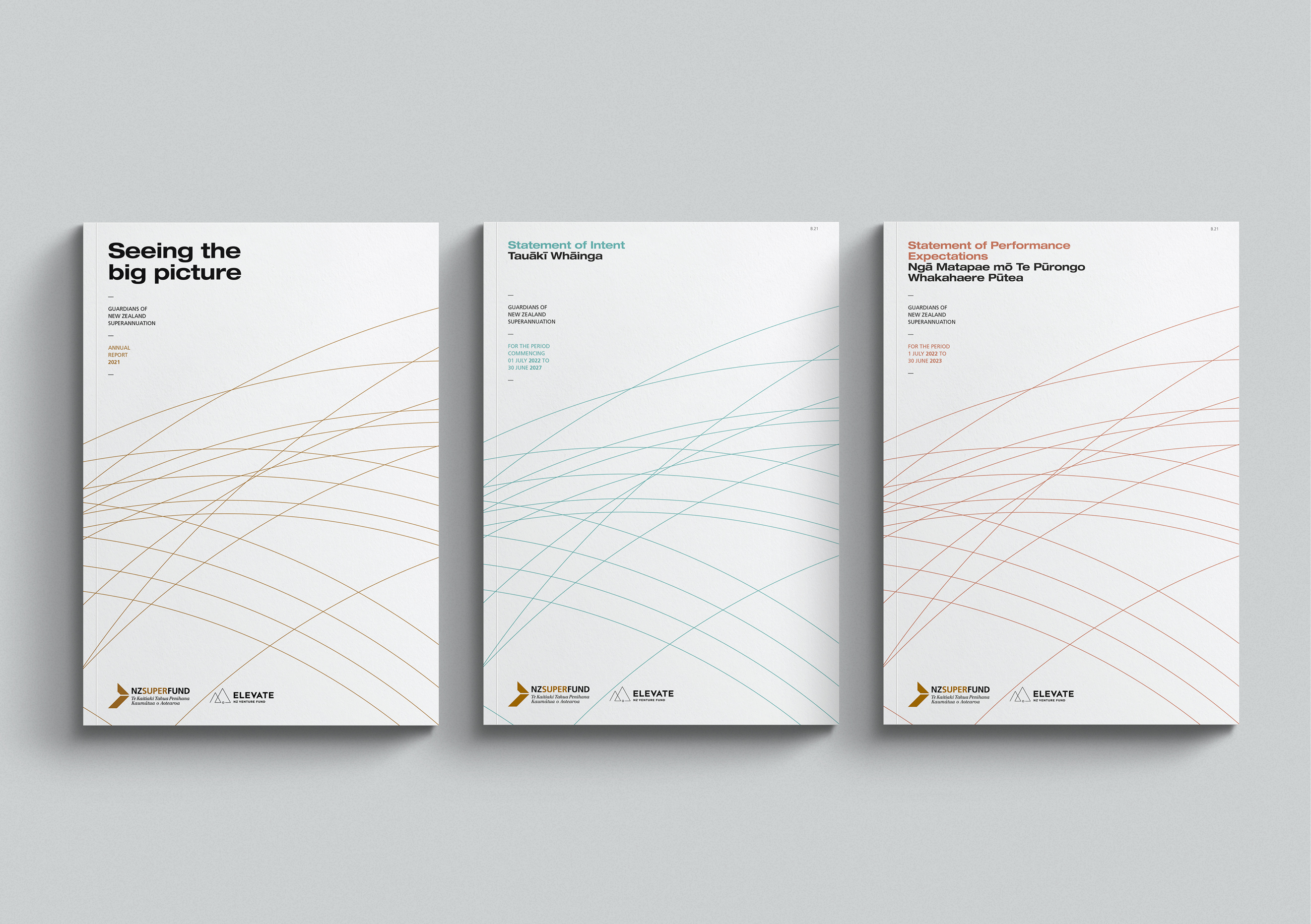
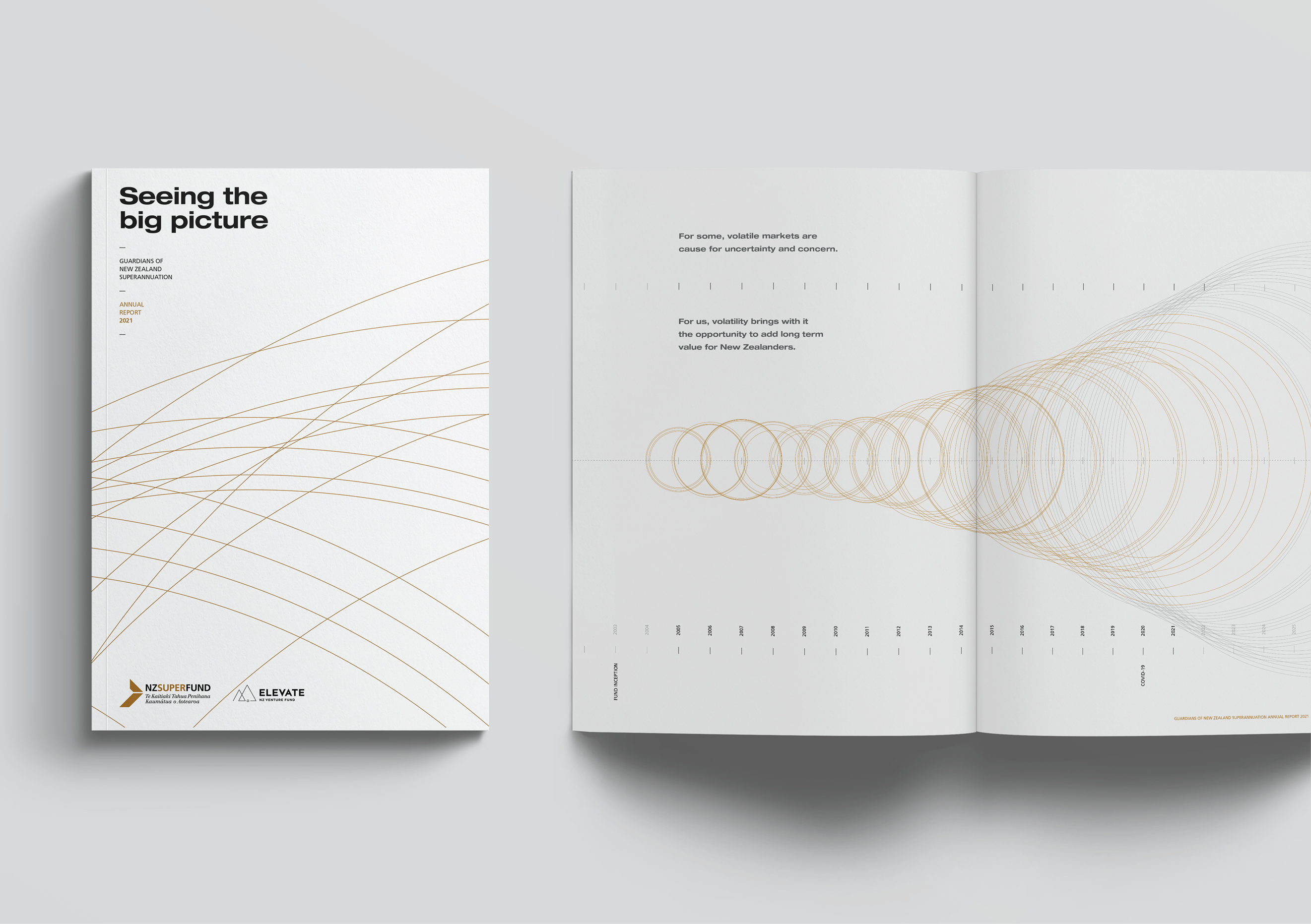
An intriguing cover hints at turbulent times, with lines heading off in multiple directions. It’s a teaser for the stylised timeline depiction of investment markets in the opening spread. Here circles represent the size of the fund year on year, getting bigger or smaller with market conditions. Over time, the trend is towards larger, providing the supporting evidence for our long-term value in volatility story.
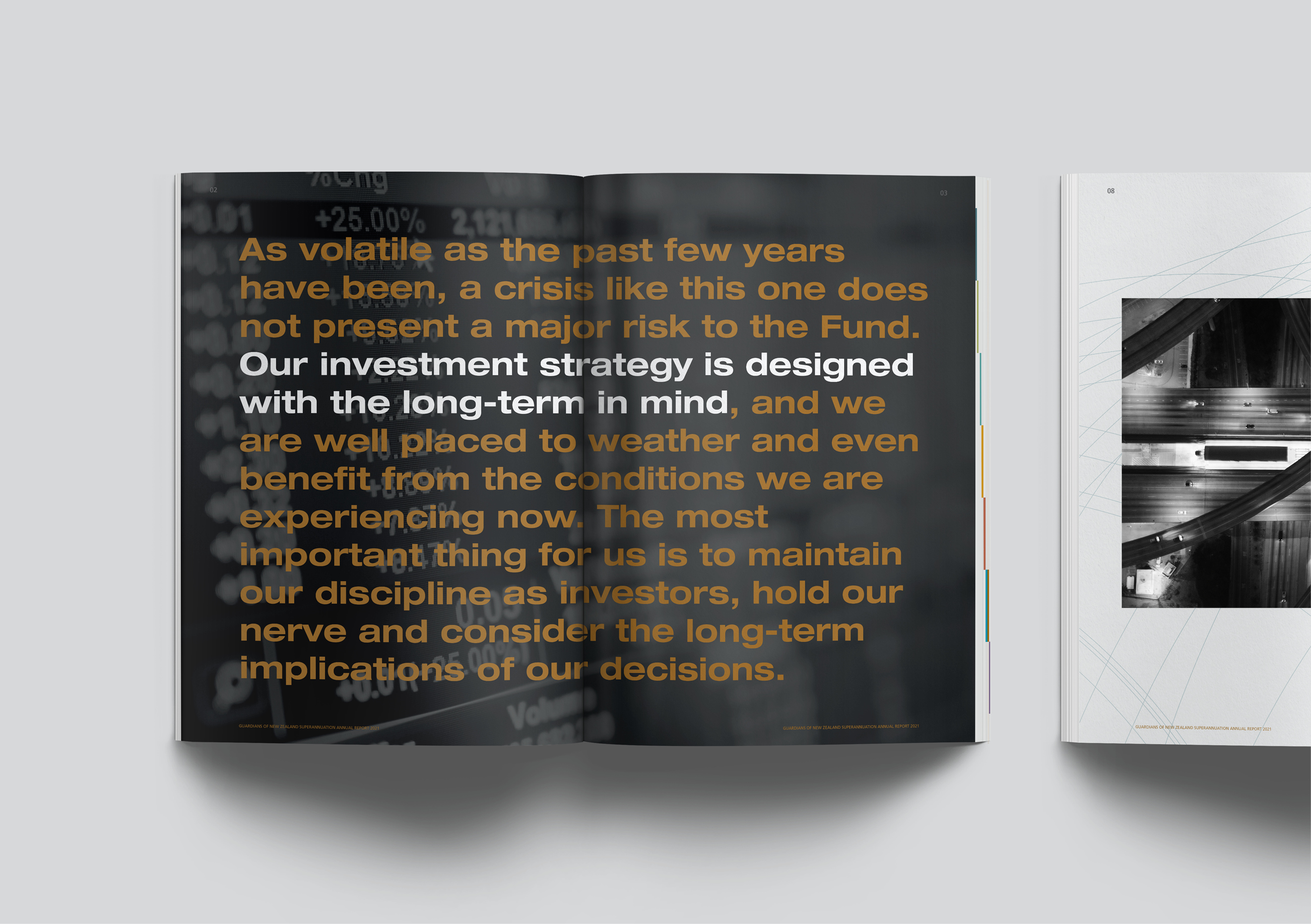
On the next spread, we speak directly to investors, expanding on our story using bold, rational and uncomplicated language.
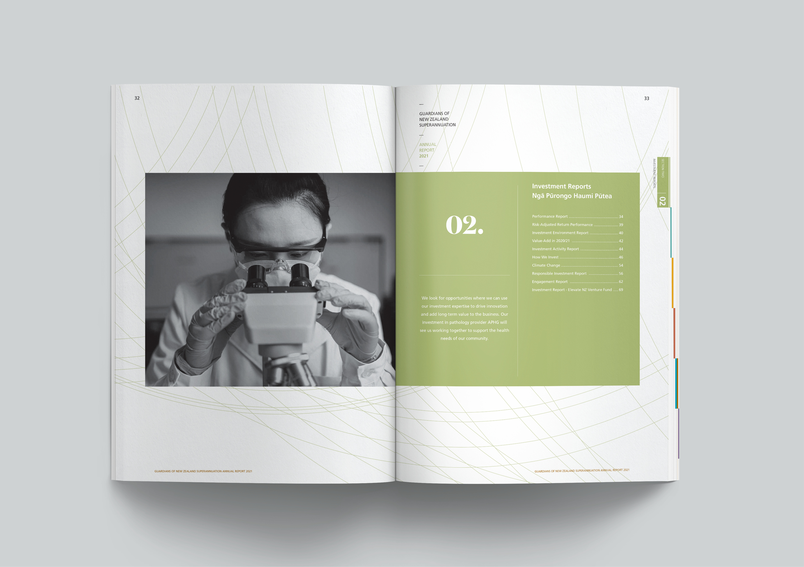
Throughout the document, we highlight stories of opportunities that emerged through crisis and how the Guardians used them to add to the potential for long term return. Each one is supported by a bold single-minded image. Black and white high contrast photography was selected for its sober no nonsense feel. Each image has impact, creating a visual pause in the clutter of a busy annual report, bringing focus to the viewer.
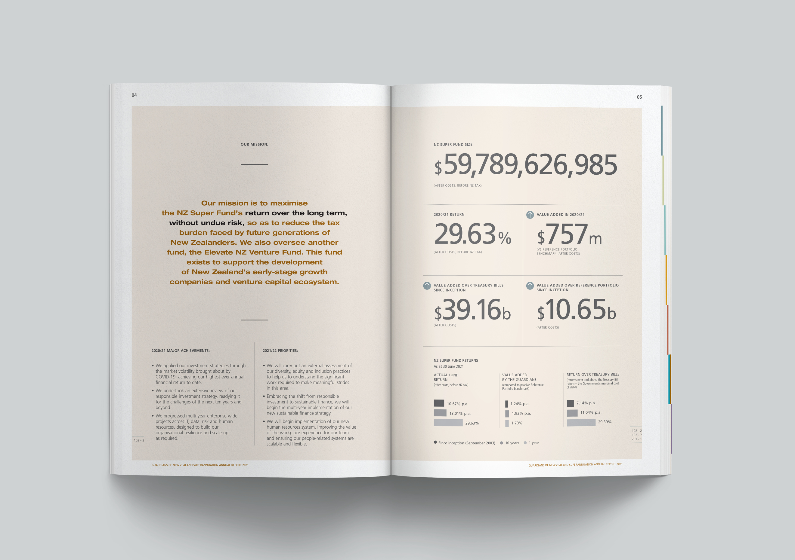
Overall the design adopts a minimalistic aesthetic that allows the message to be the hero. Helvetica extended was selected as the feature typeface for its powerful plainness. Its straightforward and familiar features allow the viewer to focus on the message without distraction or embellishment. A strong grid layout is used to counter-balance volatility, offering a sense of business as usual through tough times.
The result
The report has been well received by stakeholders and investors and was awarded the ARA (Australasian Reporting Association) Report of the Year for 2022. The judges noted that the report sets the benchmark, in clear and compelling storytelling, for all others to follow.
