Reframing the conversation to drive change
Client: NZ Drug Foundation
Substance abuse often attracts media coverage that can glamorise the issue that it is trying to discourage.
By providing a useful tool for journalists, we constructively suggested more constructive ways to report on the issue.
Brief
The NZ Drug Foundation asked us to create an engaging mailing piece for journalists and media that had real cut through, educating and informing them on effective reporting of Volatile Substance Abuse (VSA).
Many VSA news stories become sensationalised by the use of particular language or images that act as a how-to-guide for volatile substance users. The client wanted to illustrate a better way to report on VSA. A way to re-frame the conversation and drive change.
The Solution
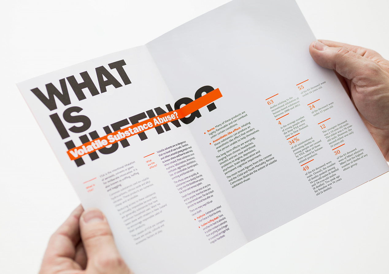
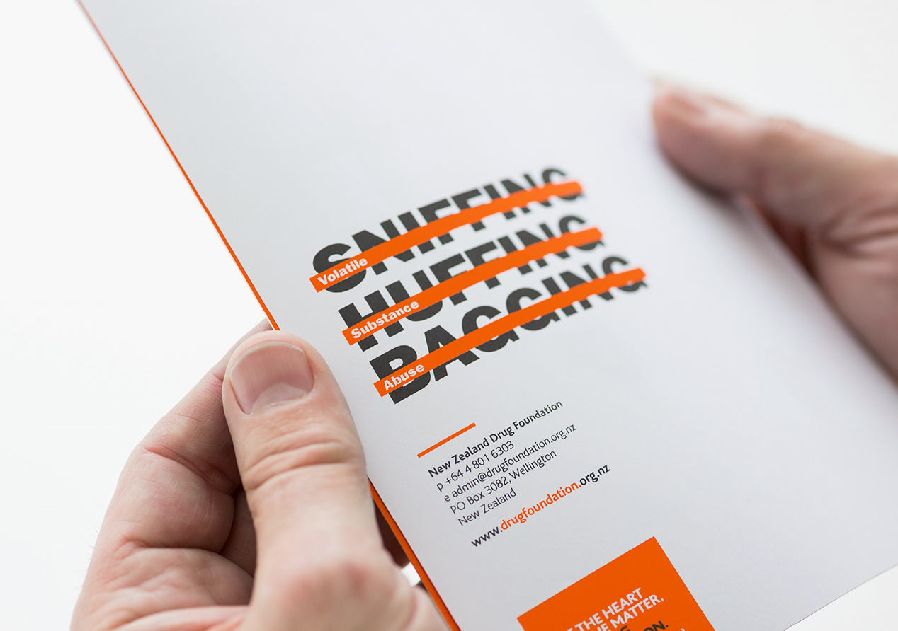
Our creative solution drew on the journalistic vernacular of ‘showing not advertising.’ We wanted journalists to avoid showing pictures of inhalants, so as not to glamorise the issue, and to refrain from using ‘cool’ street terms - like Huffing, Bagging and Sniffing. The challenge was to communicate effectively to media, demonstrating the change required and how to achieve it, all without using the terms and images the media relied upon to understand the issue.
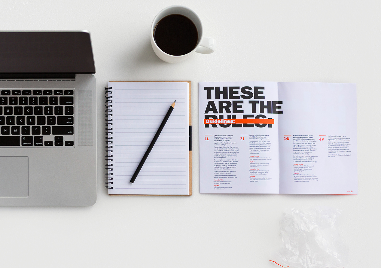
We wanted to create the feel of a booklet, as opposed to the standard DL, to give it more presence and to make it feel like a valuable guideline rather than a sales brochure.
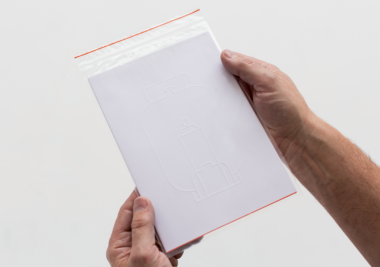
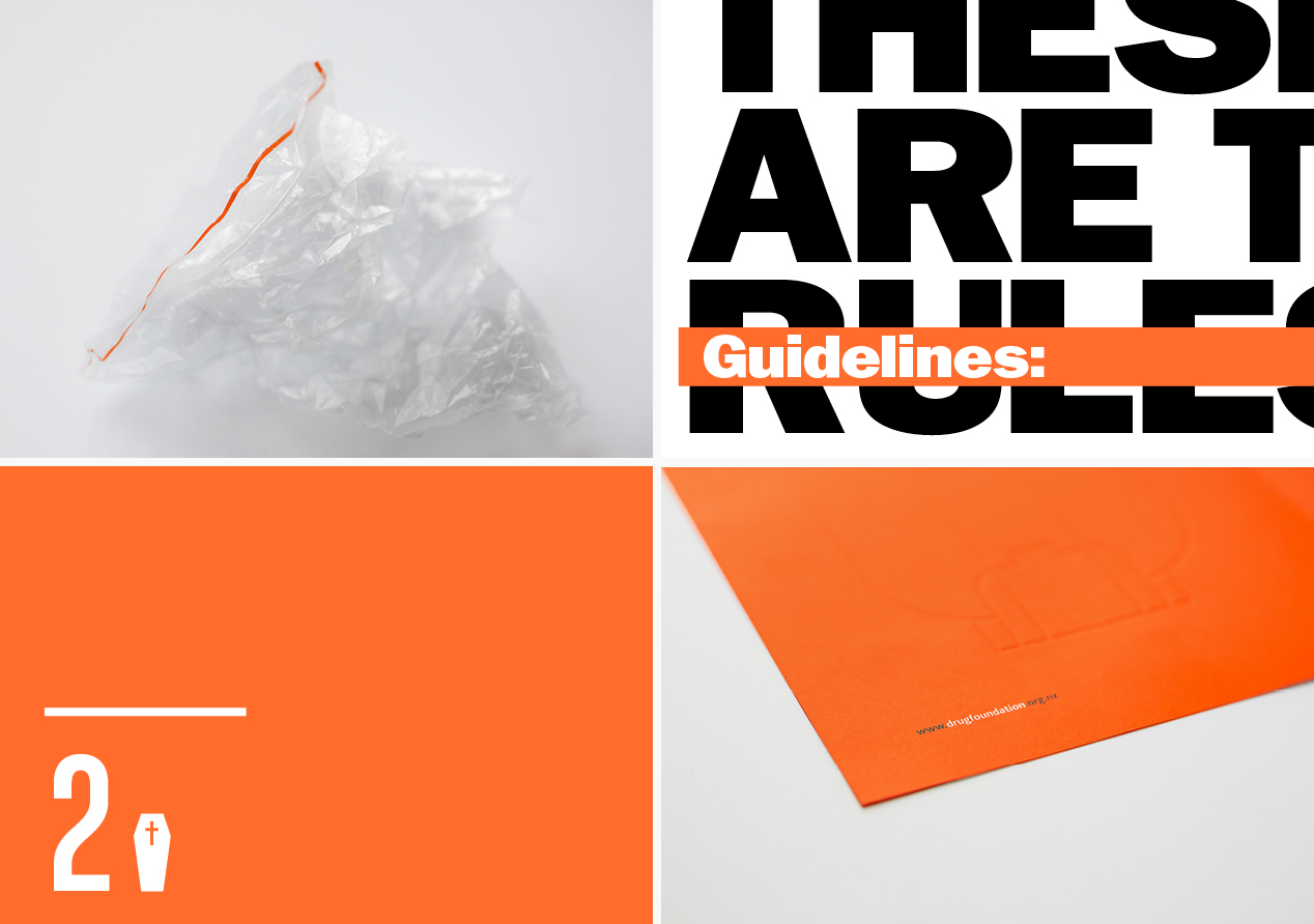
The booklet is housed in a clear plastic zip lock bag, a clear reference to Huffing, that also doubles as the mailing envelope. Visible through the see-through bag, the document’s white front cover has a subtle outline emboss of a variety of aerosols commonly used in VSA. This intriguing approach kept true to the creative concept by showing outlines rather than advertising particular products.
Headlines are big and confident and we use strikethrough blocks to great effect to show words to be replaced with more appropriate words. This editorial vernacular of headlines and ‘mark-ups’ offers a sense of familiarity to the audience.
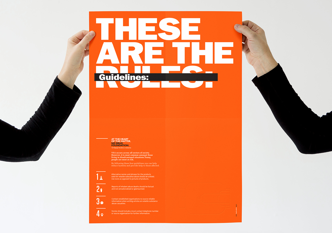
The booklet folds out into a vibrant ‘tabloid-esque’ poster which highlights the key points, providing easily accessible information on the wall or at their fingertips when journalists most need it.
The overall feel is bold and authoritative, providing clear instructions and showing them in action.
The Results
Feedback from our client: “We have been contacted by a number of journalists for more information on how to report on VSA. We’ve also seen misreporting of VSA fall in publications we specifically targeted. Media are using more correct terminology and providing the right information, which was the ultimate goal of the brochure. The brochure delivered results, with the design complementing and enhancing our messages."
