Focusing the drug conversations
Client: NZ Drug Foundation
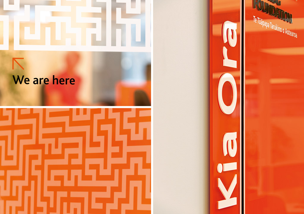
The working environment can say a lot about an organisation – both workers and influential visitors.
The refurbished office space for the NZ Drug Foundation lacked character and soul. So we set about stimulating the team and visitors while adding warmth and humanity.
The Brief
The New Zealand Drug Foundation moved into their newly refurbished, contemporary space but felt it lacked individual character and soul. They asked us to give the space a smart, less corporate ‘vibe’ that affirmed their role in NZ drug policy. Their audiences range from the staff working in the space, to members of parliament and international visitors.
The Solution
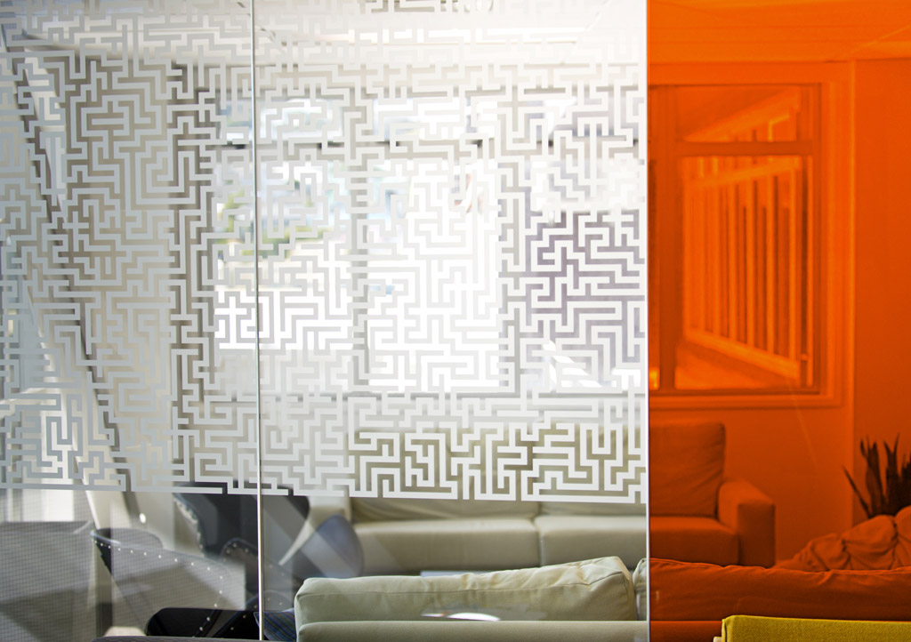
Our idea was to engage staff at a personal level while offering a sense of the big picture to visitors. We utilised the newly installed substrates to ensure our solution was as efficient as possible. We built our design thinking on what we’d already developed in their visual identity: bold orange and a maze graphic representing NZDF at the heart of a complex drug discussion.
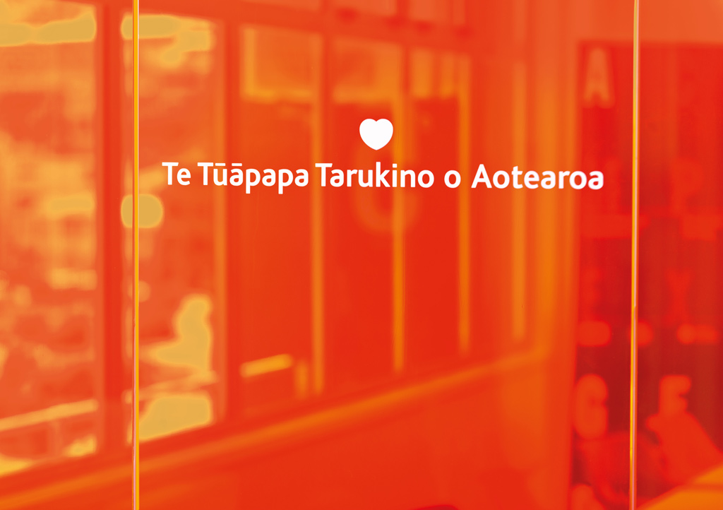
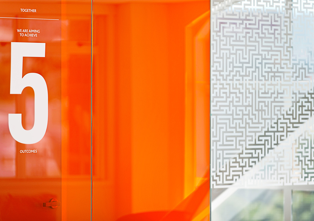
We wanted the space to feel active and multi-dimensional and glass is an excellent canvas for this. Large glass panels were covered with a double skin orange vinyl to create a luminous and energetic feel. These doubled as a privacy screen for the CEO’s office and boardroom. The use of ambient light, from north facing windows, gave warmth to the previously cool interior fit out. An external front door office sign was repurposed to be internally focused, with an additional panel added to connect the two spaces. Maze graphics with a detailed play on ‘you are here’ welcomed visitors.
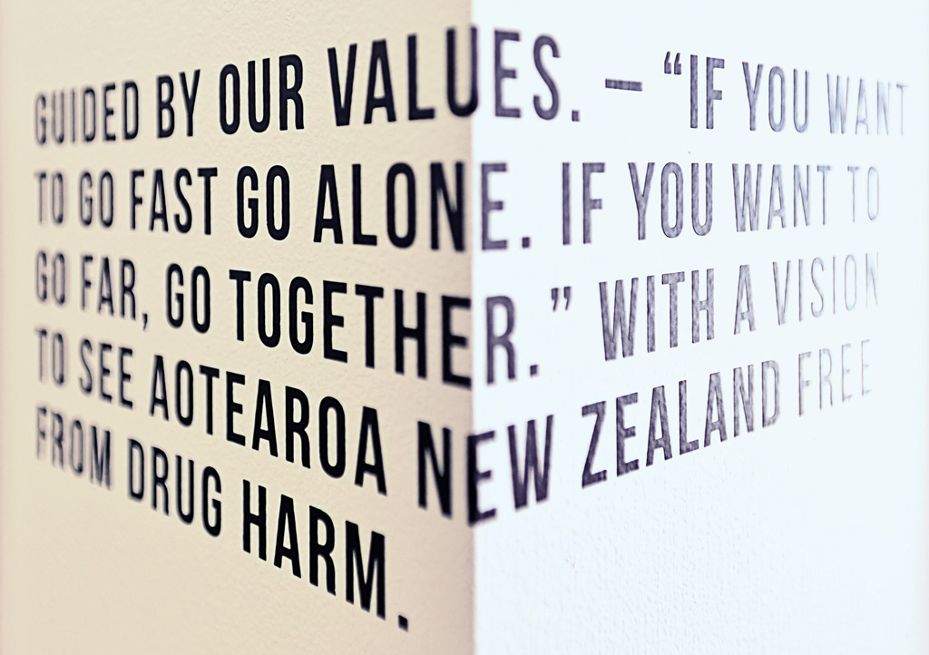
Large format type juxtaposed the fine detailed copy from their strategic plan, affirming NZDF’s role and reminding staff of their part. Language spoke in a more personal way to the architectural features used to enhance the messages.
The Results
The fit out is sympathetic to the architectural nature of the heritage building but with a sharper contemporary energy.
Staff feedback is that the fit-out reinforces a pride and passion in the organisation. They love the bold use of the colour and the warmth that it has created. Visitors are equally impressed, with guests frequently commenting on both the design and messages.
CEO Ross Bell, says “we wanted a place where ideas were exchanged and people weren’t scared to debate the issues. The highlights from our strategic intent document, the small details and a sense of attitude are helping us achieve this. It puts us into the right conversational space to think clearly, reach good decisions and to influence the right people. We’ve been repaid many times over for what we spent.”
