Driving the drug debate
Client: NZ Drug Foundation
FINALIST: 2017 BEST AWARDS
The New Zealand Drug Foundation believes that the way we currently deal with drugs doesn’t work for Māori.
That our criminal justice approach to minor offences causes more harm to Māori caught up in it than drug use itself. A series of hui was established to discuss the issue with the community most affected.
The Brief
The NZ Drug Foundation (NDF) has been at the forefront of major alcohol and drug policy debates, advocating strongly for policies and practices based on evidence. To engage Māori leaders and communities in the debate surrounding health, criminal justice and drug use by Māori, NDF created a series of Hui.
Our brief was to create a distinctive look and feel for the Hui to drive attendance and engagement. The identity needed to feel uniquely Māori, but still modern and relevant within the context of the wider national debate on drugs. An identity that was authoritative, expressing a strong sense that this isn’t yet-another talk fest but a real drive to instigate change. Leveraging off the NDF brand, it needed to compel audiences to attend.
The Solution
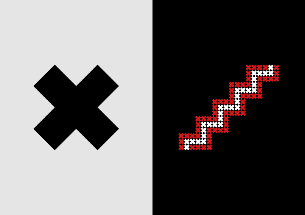
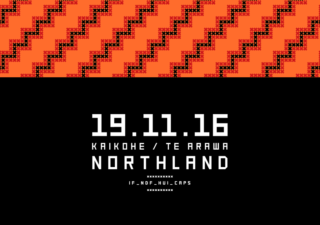
The starting idea was to engage the audience with a familiar, and uniquely Maori, symbol that they would identify with and understand. Working collaboratively with our client, led by Dr Gilbert Taurua (Principal Adviser, Tautāwhihia. Kaua e whiu), the Poutama was selected for its positive symbolism of genealogies and the growth of man, striving ever upwards, from both a religious and educational perspective. The pattern itself represents the levels of attainment and advancement – the staircase that Tane climbed to heaven to reach the three baskets of knowledge.
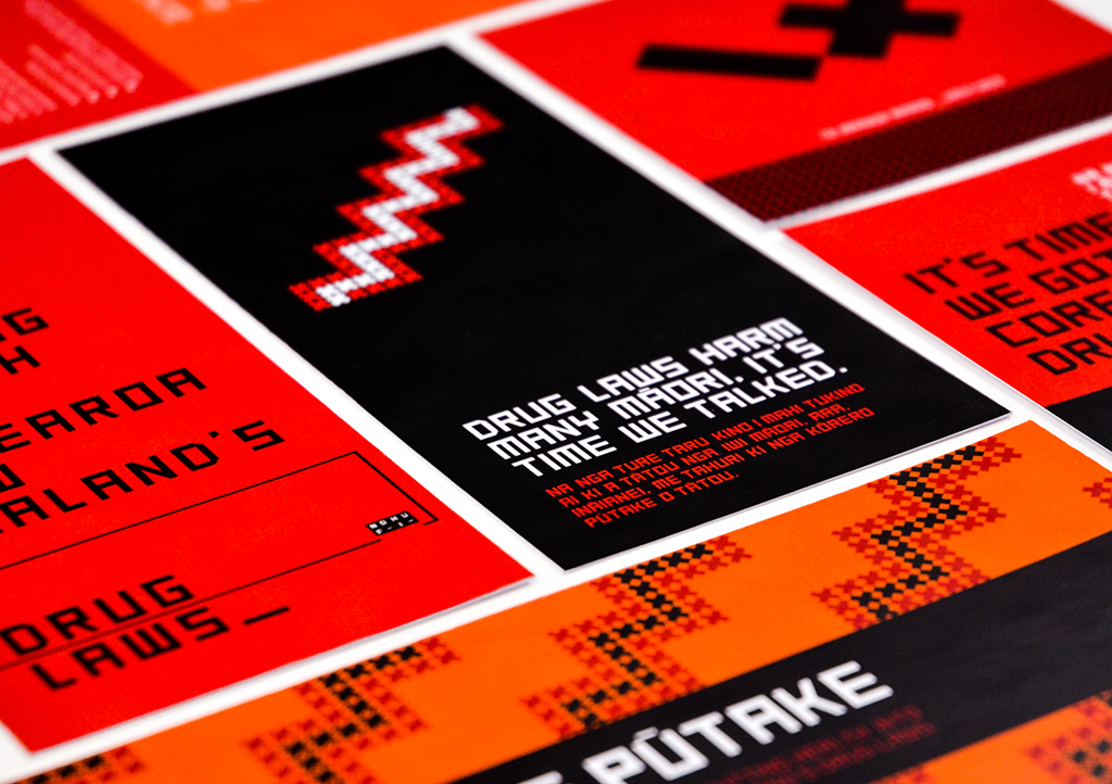
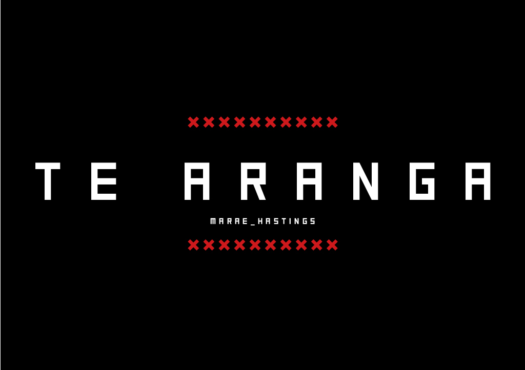
To leverage this valued understanding in a contemporary identity system, traditional weaving and stitching was used, delivering a crafted feel. Individual cross-stitch elements in the form of a grid make up the Poutama, reflecting both the grass roots nature of the discussion and a metaphor for change. The inter-weaving represents the strength of the whole, greater than the sum of its parts. This tukutuku cross-stitch theme was then translated (and digitised) into a typeface, using a simple grid system.
A straightforward colour palette of black, white and red - colours associated with Māori culture (Tino Rangatiratanga Flag) - are combined with the NDF’s brand orange to deliver a more aligned, modern and diverse interpretation. Bold, assured and uncluttered use of these colours, along with straight-up language, ensure clarity and directness of communication.
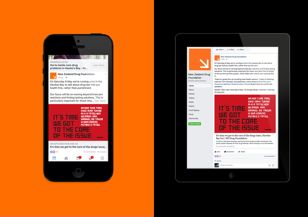
The identity came to life across a variety of executions encompassing invitations, posters, email banners, video graphics, social media advertising and other communication elements.
The Results
Hui attendance numbers far exceeded expectations, suggesting the design approach delivered both cut-through and action. Better still, audiences came with a clear expectation that they were there to drive real change and growth for Māori, allowing many new ideas to surface. NDF described our work as “instrumental in helping them achieve the outcomes they needed.”
