Keeping sub-brands within the family
Client: Mighty River Power
Mighty River Power subsidiary, Metrix, moved to larger and more dynamic premises.
The fitout needed the injection of motivational energy, Metrix brand qualities as well as reinforcing their role as part of the wider Mighty River Power family. Metrix have proclaimed the positive impact the space has had on their productivity and culture, they’ve made a video of it!
The Brief
Metrix, a Mighty River Power company, provides advanced metering systems and services to New Zealand’s electricity retailers. For their move to larger, more dynamic premises, they needed a fit-out design that reflected the Metrix brand qualities while firmly reinforcing to staff that they are part of the wider Mighty River Power family.
The Solution
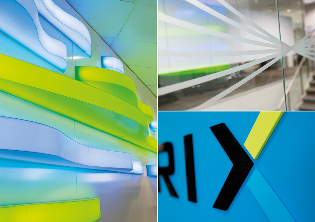
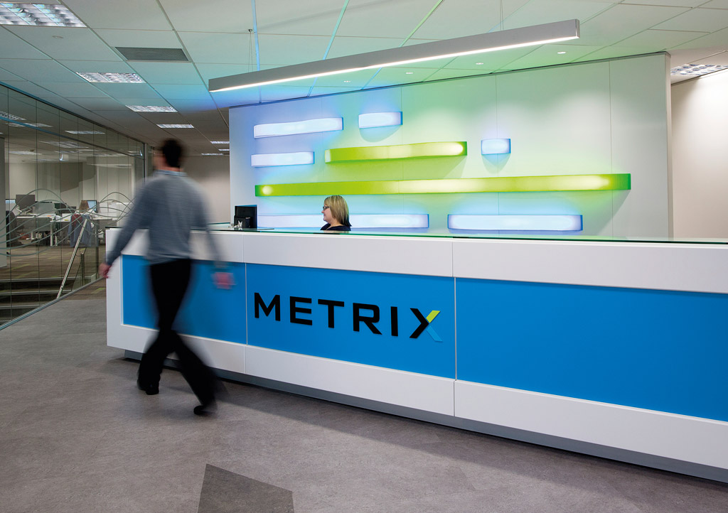
The Metrix identity was kept to areas customers would be exposed to: reception and meeting rooms.
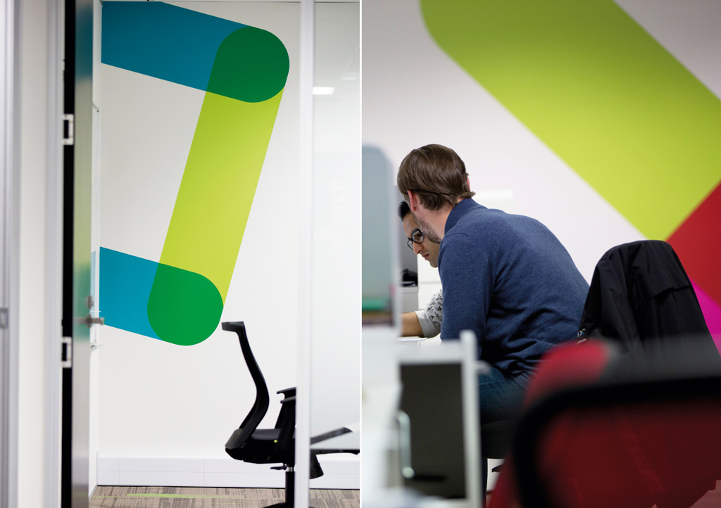
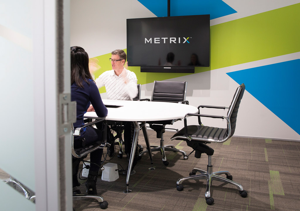
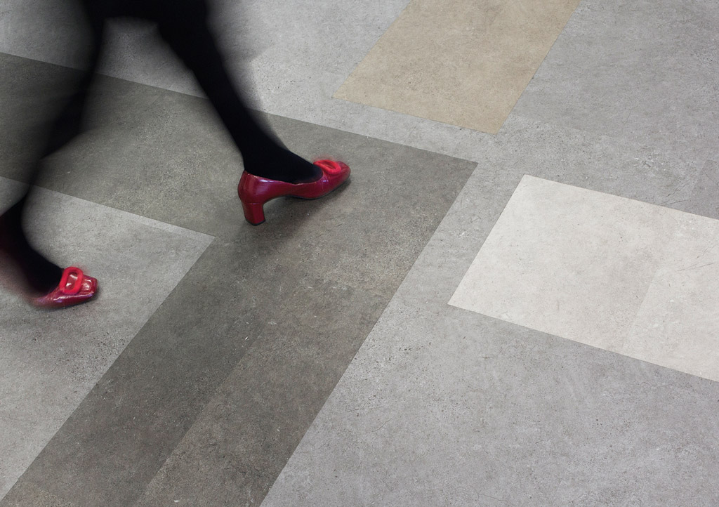
A key element of the Metrix brand is a series of interlocking wavy lines that reflect the nature of their business, electricity and the reading of meters. These wavy lines, plus the X of the Metrix name became the kick-off points for our design thinking. To create a strong focal point and a clear expression of the dynamic nature of the brand, we produced a lightbox installation for reception formed by a series of ‘lines’ in their brand colours. A concrete effect floor was laid with different tones making up the ‘X’ of their name, while also helping lead people to reception. This notion of using the ‘X’ as a stand out graphic was then carried through to the three public facing meeting rooms, creating a connection between reception and other spaces.
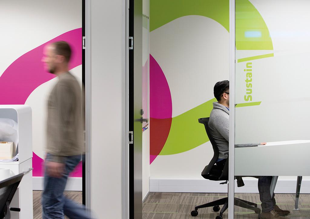
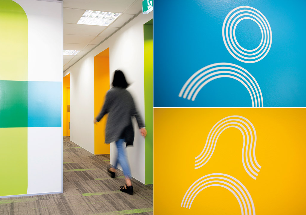
For the office interior, the Mighty River Power internal brand elements were used. The internal ‘One Team’ brand is communicated graphically with a series of illustrations that all work or are connected together, represented in Mighty River Power’s supporting brand colours. These were primarily used in the meeting rooms, not only to add interest and colour but to reinforce Metrix’s part in the wider Mighty River Power team.
The office is a busy and bustling place so the graphics and colour palette were selected to emphasise this through vibrant colours and energy.
Collaboration areas were also devised, giving employees a space to brainstorm ideas, pin work up or to write notes on the glass. We used back painted glass whiteboards and black noise reduction paneling (which doubled as pin boards) to ‘black out’ the collaboration spaces and create a sense of reprieve from the rest of the busy office.
The Results
Our client is enjoying their new space so much so they’ve made a video proclaiming the positive impact the space has had on their productivity and culture.
