The Ripple Effect
Client: Mercury
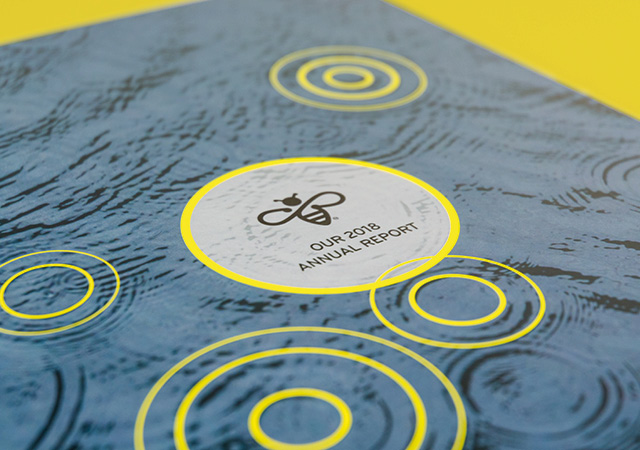
The goal for the 2018 Annual Report was to tell Mercury’s brand story in a new, and more connected, way.
The Brief
After winning gold medals at prestigious international awards for the previous two reports – including New York’s ARC Awards (Best International Annual Report in 2017) - expectations for something new and interesting were high for Mercury’s 2018 annual report.
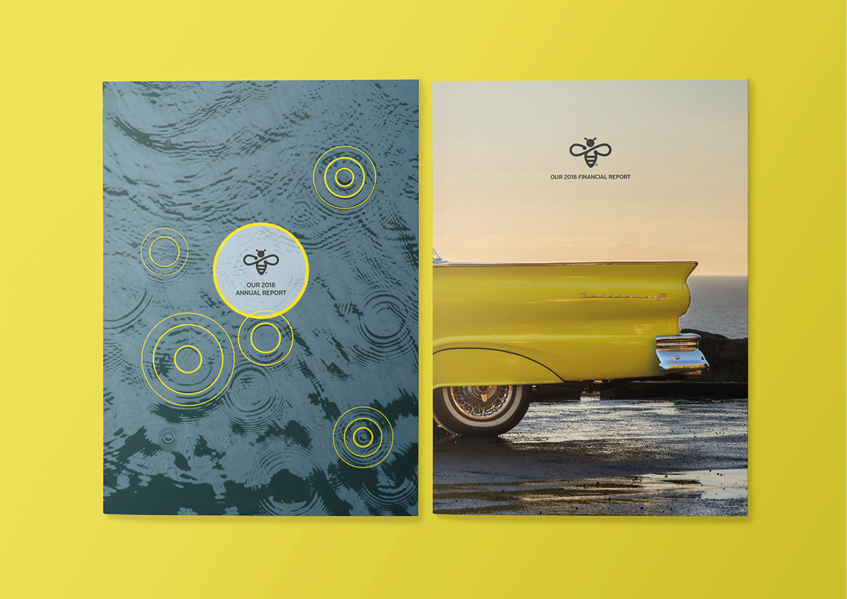
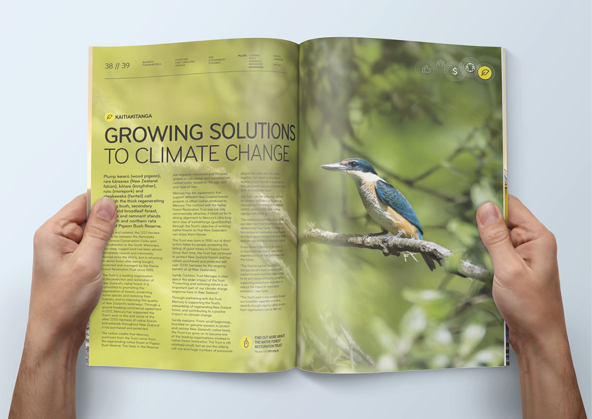
Like the previous two reports, Mercury’s ‘energy made wonderful’ brand proposition led the way. The goal for this year was to tell this story in a new, and more connected, way. Our key design idea - the ripple effect – became a visual representation of how Mercury’s actions were inspiring customers, staff and stakeholders and how their actions were inspiring Mercury.
The Solution
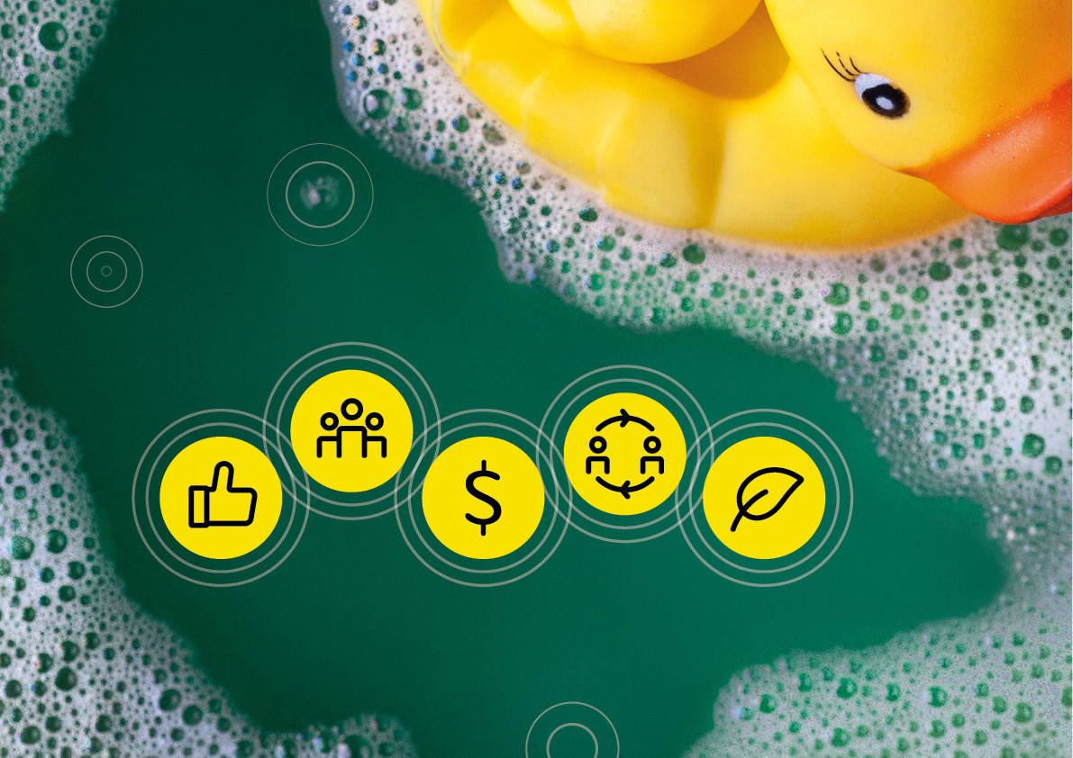
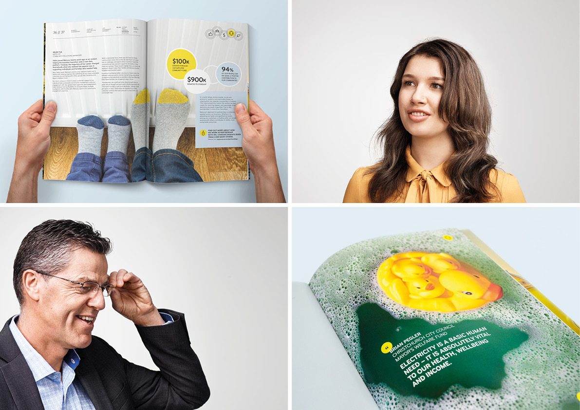
We previously talked about the brand positioning and used customer stories as proof points. This time around, we put the focus firmly on the actions of Mercury’s customers, partners and staff. Each of five action stories connected to the core Mercury brand and supported one, or more, of the key ‘pillars’ that underpin their integrated approach to business and reporting. A series of radiating circles (ripples) we’re used to connect actions and outcomes.
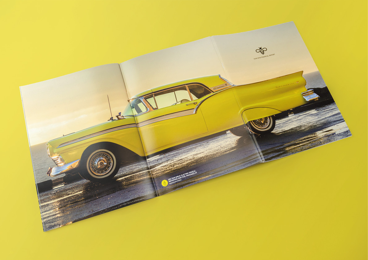
The two documents – annual review and financial report – were connected using a concertina arrangement, directly linking actions in one document to results in the other. The two cover approach gives audiences the freedom to select story-telling or financials, while still ensuring that the cause and effect connection between the two is evident.
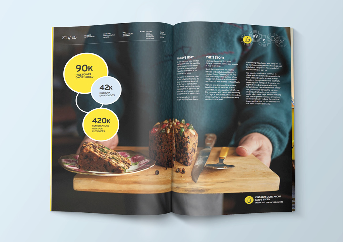
This ‘extended cover’ approach created two large spreads to tell connected stories. Highlighted water ripples on the review cover set the tone and become a design device to connect ideas and actions with the key results for the year. The ‘Evie centrespread’ supports the story of both Mercury and customers embracing sustainable energy.
Continuing the ‘action inspiring action’ theme, readers were invited to also take action throughout the document – sign-up as customers; donate to charity; get special deals; go on-line for more information and more.
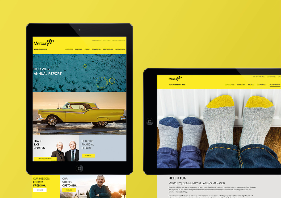
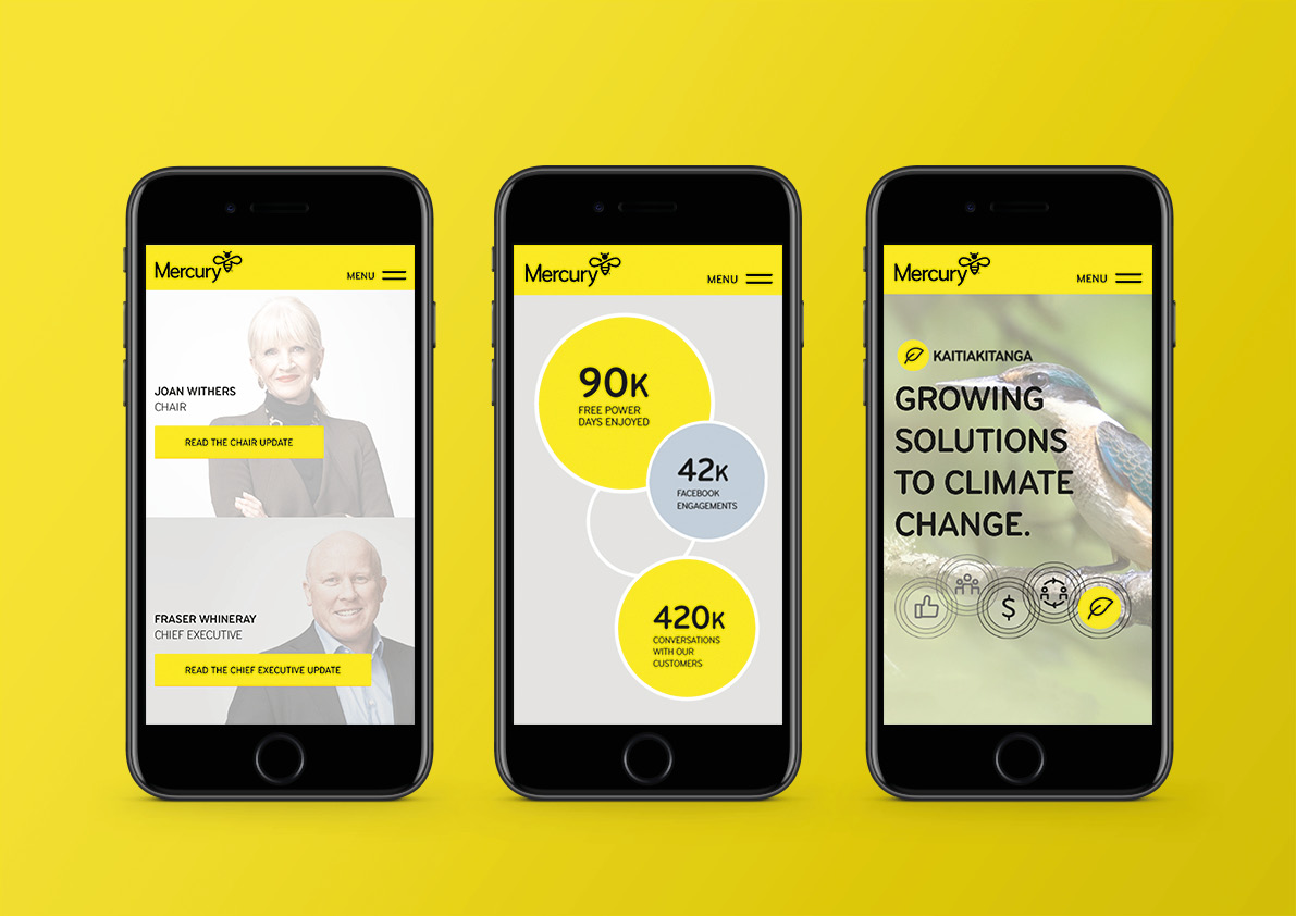
The printed report was complemented by an on-line annual report microsite. This carried through the same design ideas of the printed document and further encouraged shareholders to take actions.
The Results
Feedback from shareholders and Mercury’s peers has been overwhelmingly positive, inspiring us, and the Mercury team, to keeping pushing an innovative approach to brand story-telling. In the last six-months, we’ve been approached by a number of big New Zealand corporates to work on their annual reports. Many of these have cited the Mercury ‘ripple report’ as the standard they want to achieve.
