Bringing choice alive
Client: Mercury
GOLD: 2018 INTERNATIONAL ARC AWARDS
GOLD: 2017 INOVA WEBSITE EXCELLENCE AWARDS
FINALIST: 2018 BEST AWARDS
One-hundred and thirty plus pages of detailed reporting isn’t the ideal vehicle for telling an engaging story about how Mercury’s energy makes people’s lives better.
We responded to the challenge with a ‘choice’ magazine-style experience, online and off.
The Brief
The brief for the 2017 AR had two potentially conflicting elements. Firstly, Mercury wanted to express their brand proposition – energy freedom – in a tangible way, showing what it meant for customers and highlighting just how differently they are doing things. This story-telling requirement was offset by the desire to adopt an Integrated Reporting framework, requiring more detail, more structure and a whole lot more pages.
The Solution
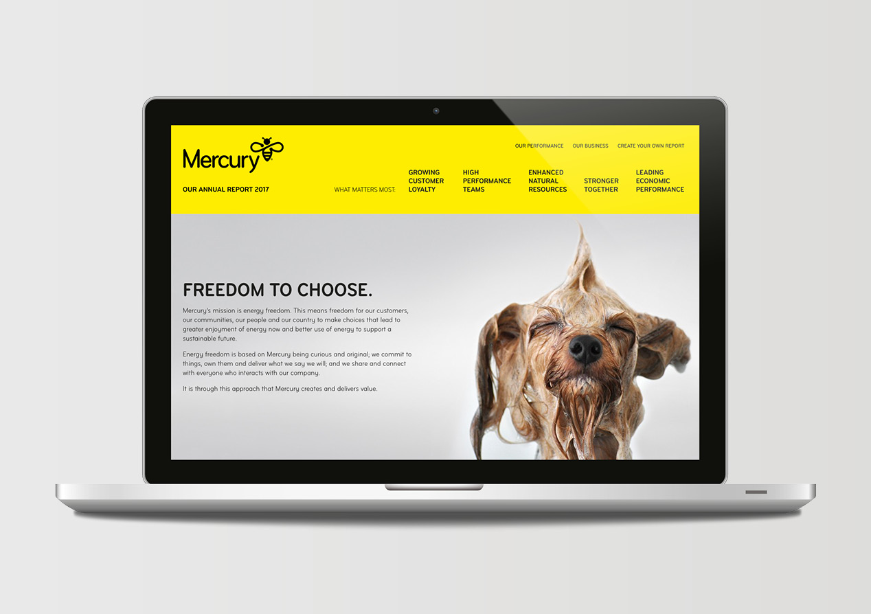
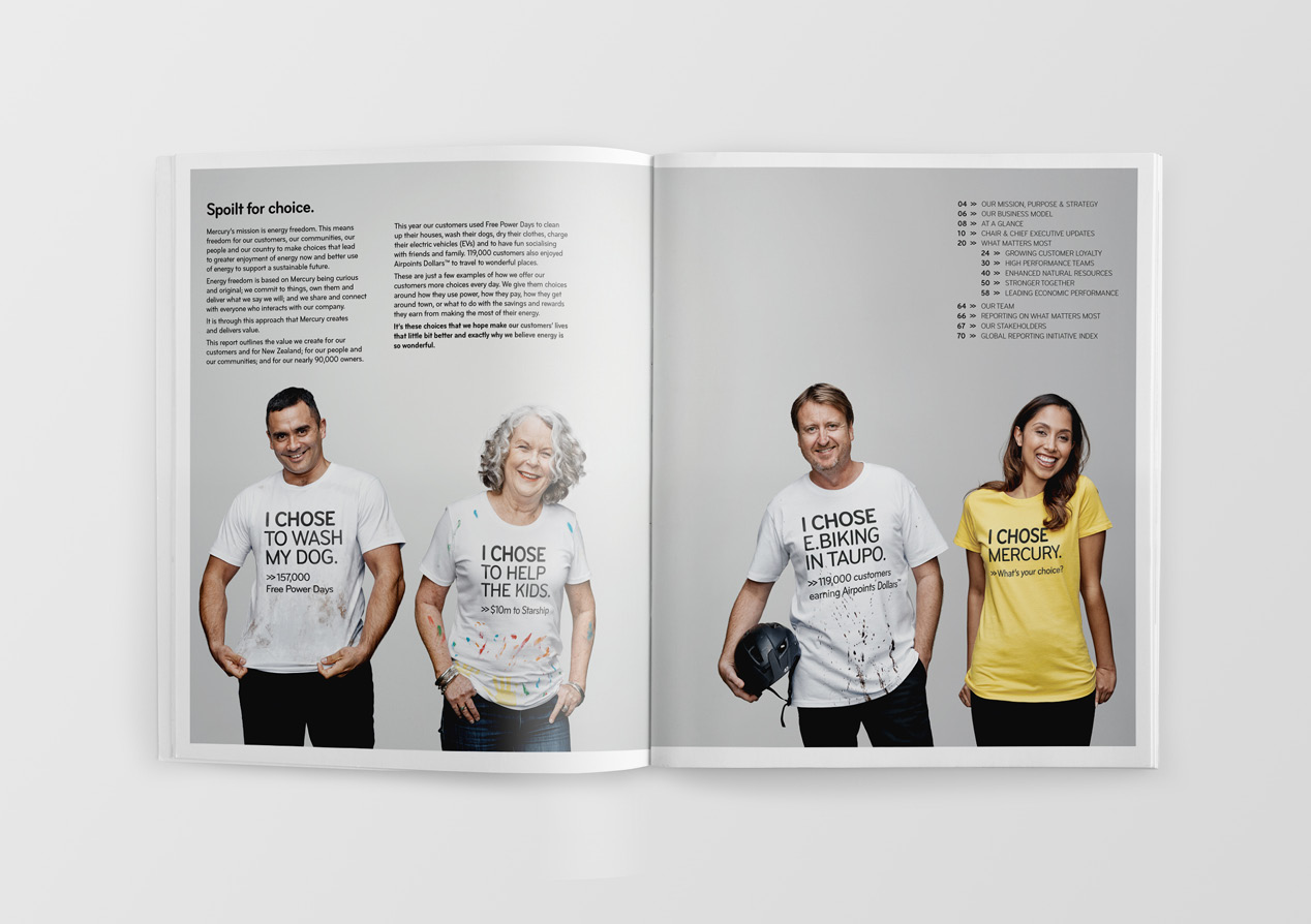
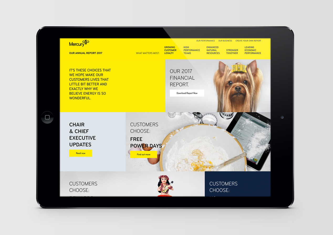
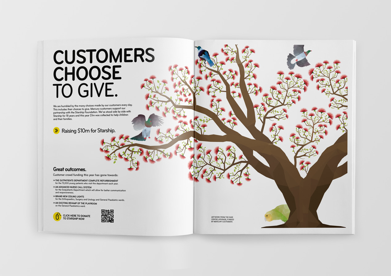
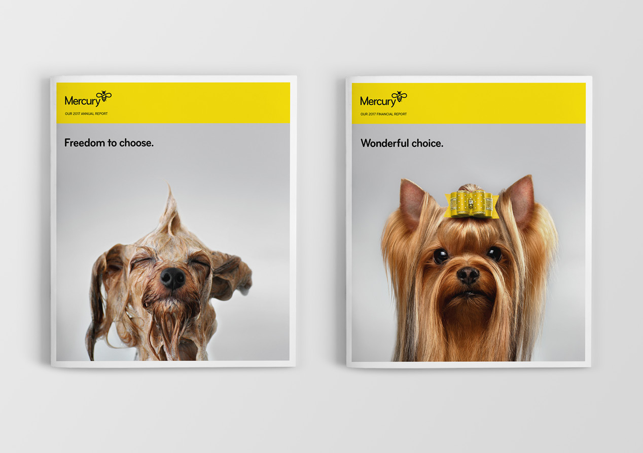
We started by presenting a series of potential visual and messaging directions. Working through these with the Mercury team we agreed on the single-minded idea of Choice. Mercury gives customers choices that lead to greater enjoyment of energy today and better use of it for tomorrow. This includes Airpoints rewards, free power days, e-bike and EV offers, Starship donation and solar deals. This choices journey begins with the curious wet dog cover, the first of many expressions of what energy freedom means for customers.
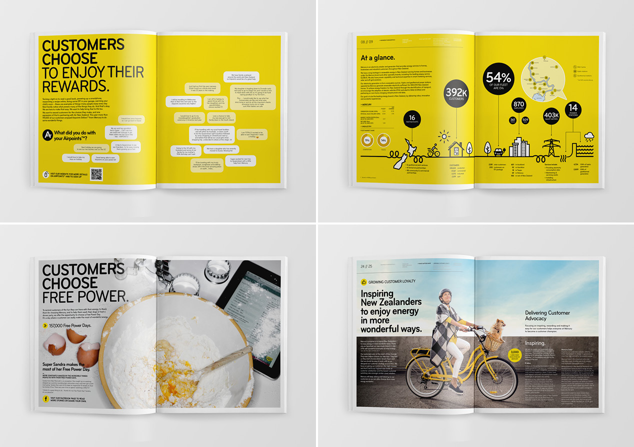
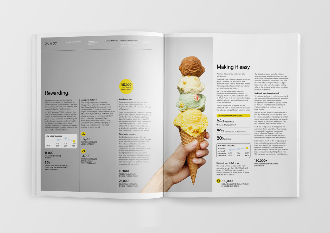
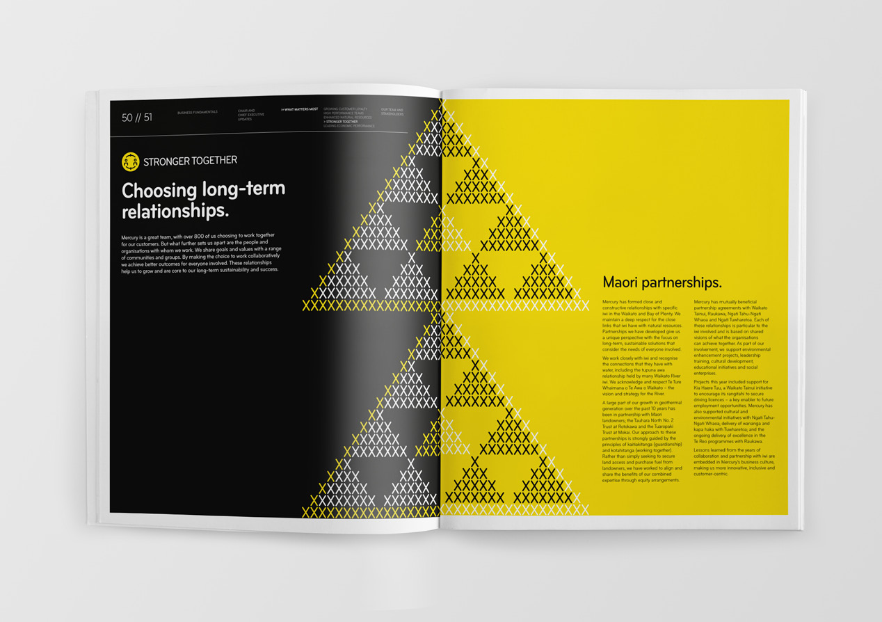
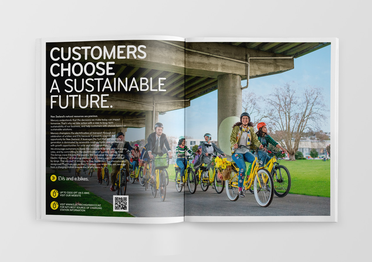
Creatively we wanted this report to feel dynamic, original, real and connected. To achieve this, we balanced a series of big ‘feature spreads’ with lots of smaller on-the-ground stories, quotes, big numbers, images and choice proof points. We chose a high-end magazine style approach because of how well it accommodates mass content and for the energy and pace it offers. This is reflected in the document size and paper stock selection.
We wanted choice to not just be a creative theme but a living part of the AR experience. This lead to the two-cover idea – giving audiences two different ways to engage with the document. Further customer choice expressions like a customer sign-up offer, donating to Starship and connecting with on-line offers (via links and QR codes) bought the central idea further to life.
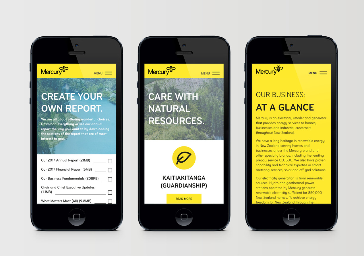
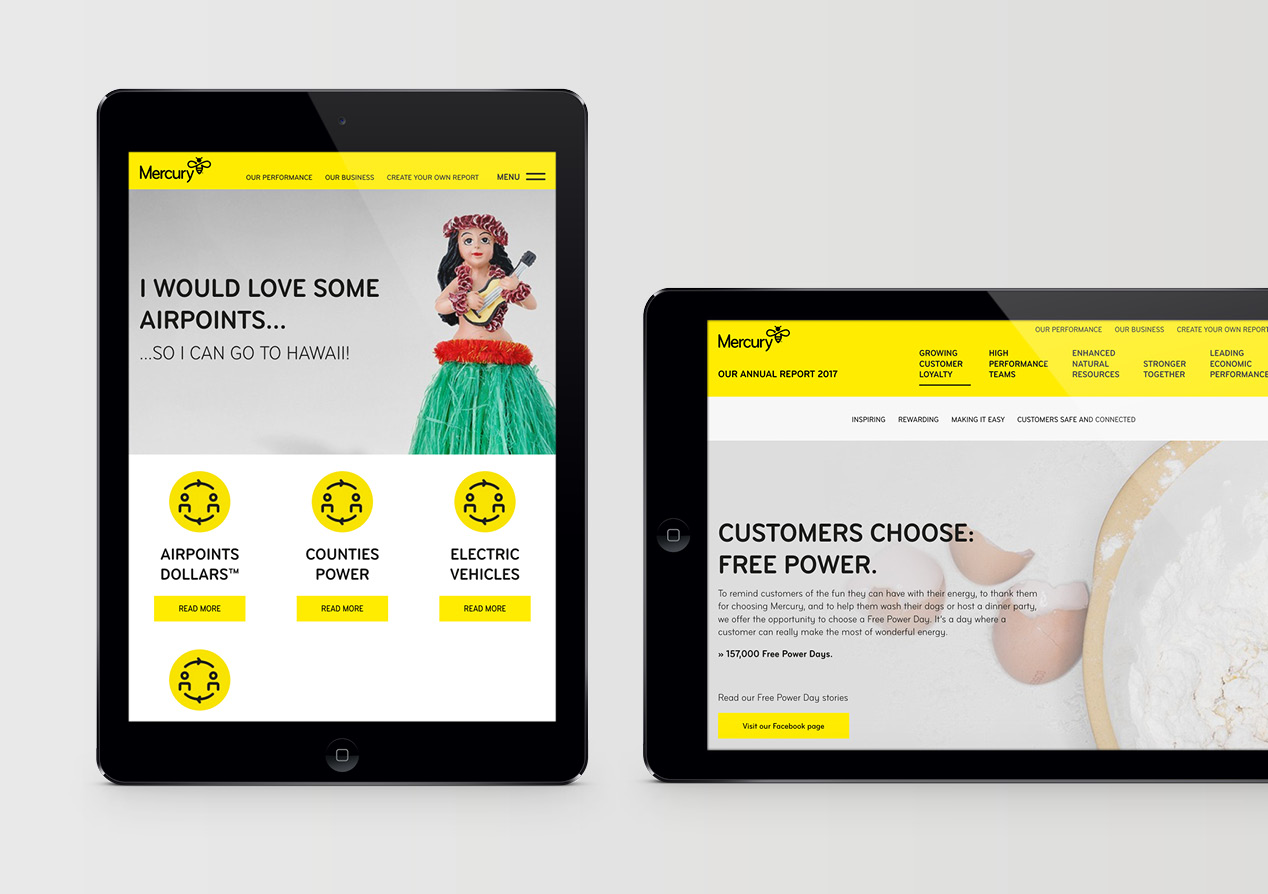
Having a dynamic online version of the report was also key to illustrating choice. The AR microsite reflects the retail tone of Mercury’s main site while also having a strong on-line publication feel. The result: an annual report website like nothing seen here before.
The Results
The client’s had a phenomenal response from shareholders, staff and other stakeholders, quickly becoming one of the clearest and most aspirational expressions of their brand proposition and personality. And we knew we were on to a winner when some of our other clients started pointing to this report as the standard they also wanted to achieve.
