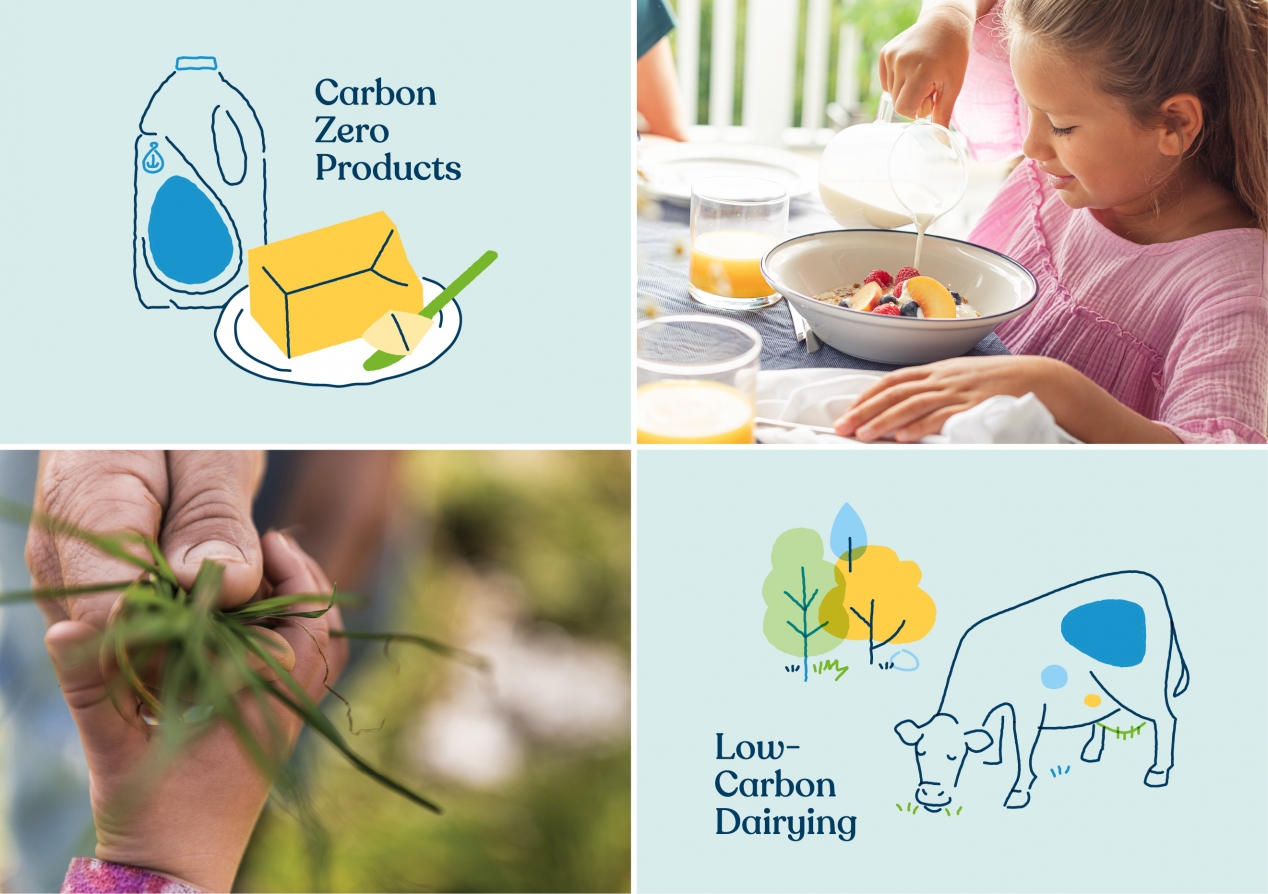
Fonterra strengthens its sustainability communication
Client: Fonterra
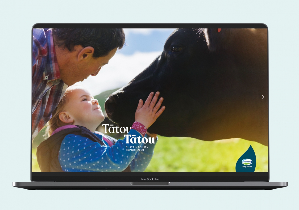
A close cousin to the 2020 Annual Report, the Sustainability Report tracks, in-depth, the company’s progress in its critical non-financial areas.
The Brief
Fonterra’s Sustainability Report tracks the company’s – and the farming community’s - rapidly evolving journey in the area of corporate responsibility and sustainable practices. Given the economic importance of milk production to the New Zealand economy and society’s growing expectations of minimising harm to our environment, it can be a tricky path to tread.
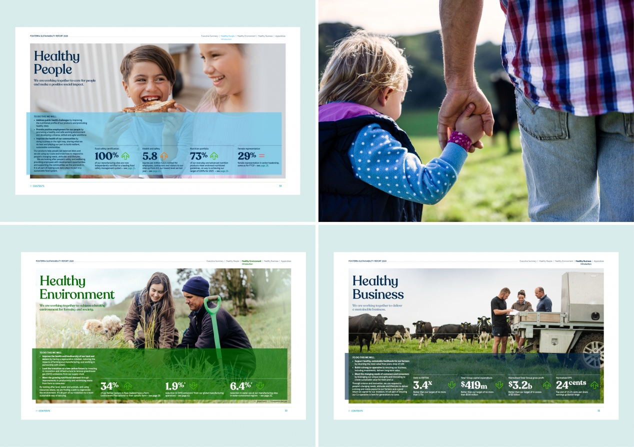
But there’s more to Sustainability than environmental factors such as land and water, emissions reduction, energy efficiency and waste minimisation. Fonterra also has significant impacts in the areas of food quality and nutrition, worker/farmer health and safety and wellbeing, workforce equality, skills development and career opportunities, animal welfare, and community economics. So a whole plethora of non-financial issues that are incredibly important to the overall health of the company’s ecosystem, while also impacting New Zealand well beyond farming communities.
This year, Fonterra wished to further sharpen their clarity and communication effectiveness – providing a quality overall story for those with a general interest, while also providing in-depth information for more specialised interest groups.
The Solution
One of the earliest decision points was to design totally for an online environment, so that physical impacts were fully minimised – a departure from the previous years’ printed reports with a simple online pdf equivalent. However, a fully-fledged Sustainability Report micro-website was out of the question because of technical limitations.
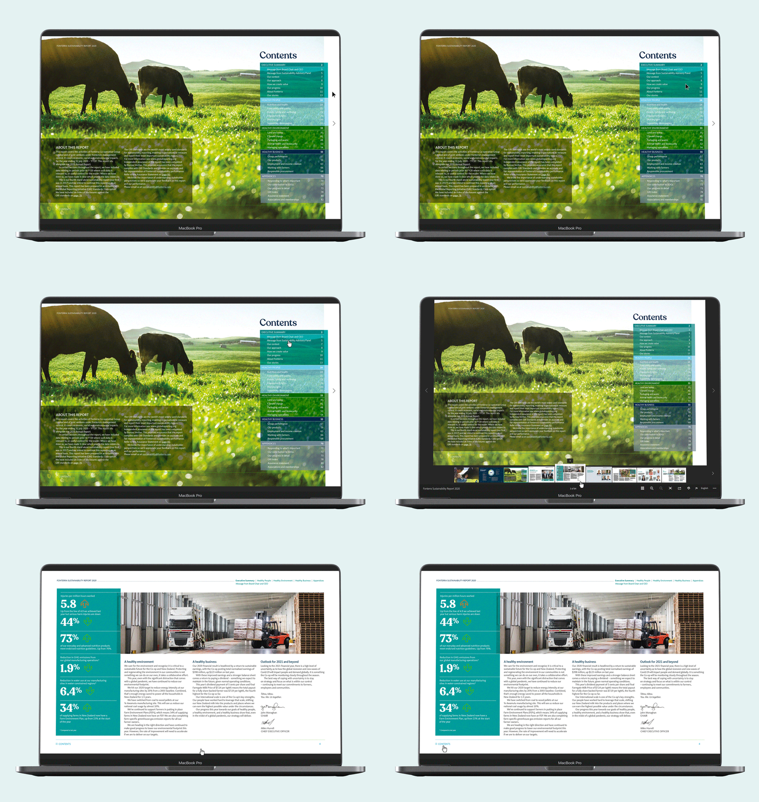
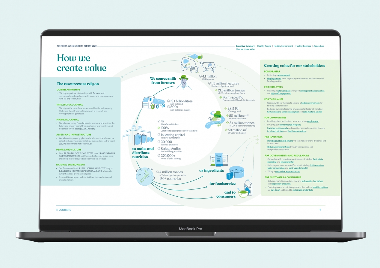
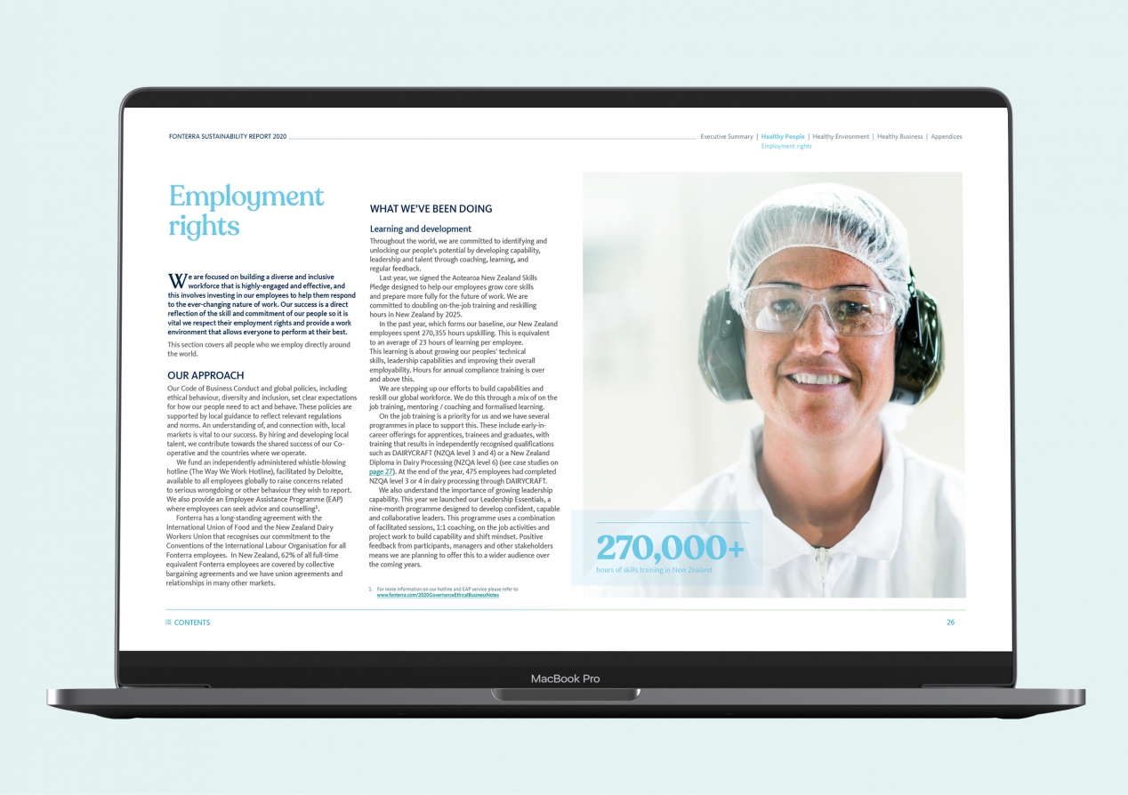
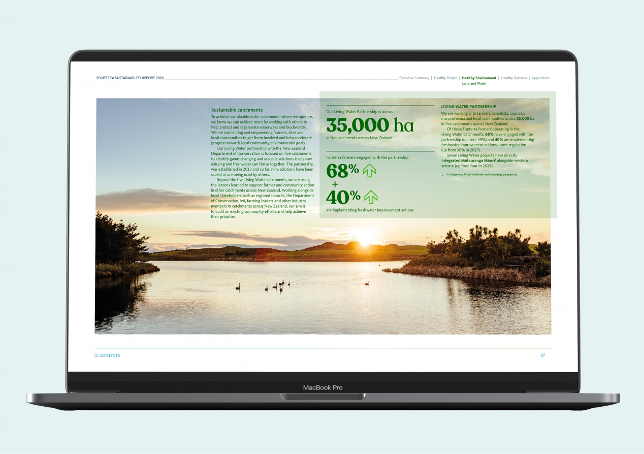
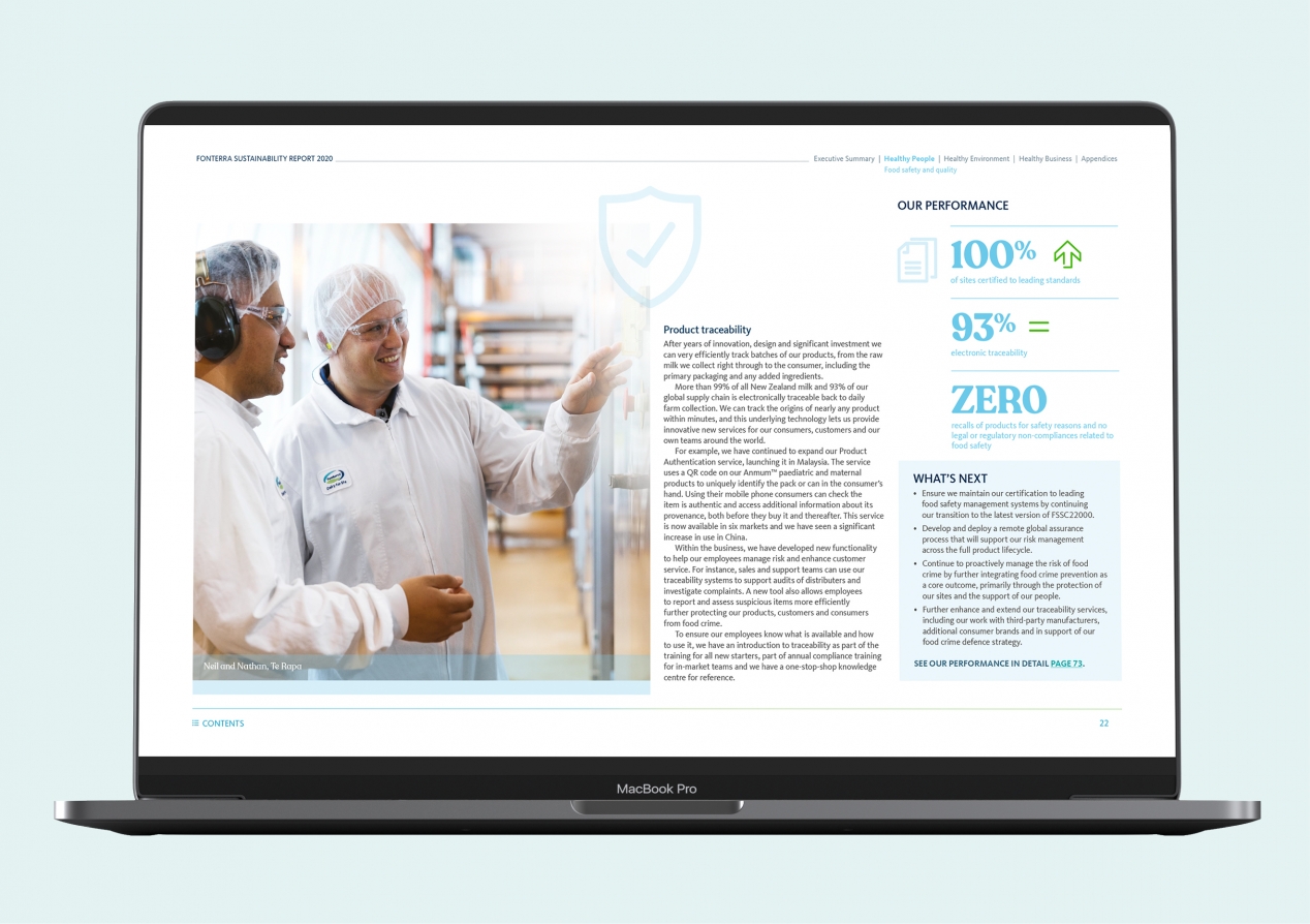
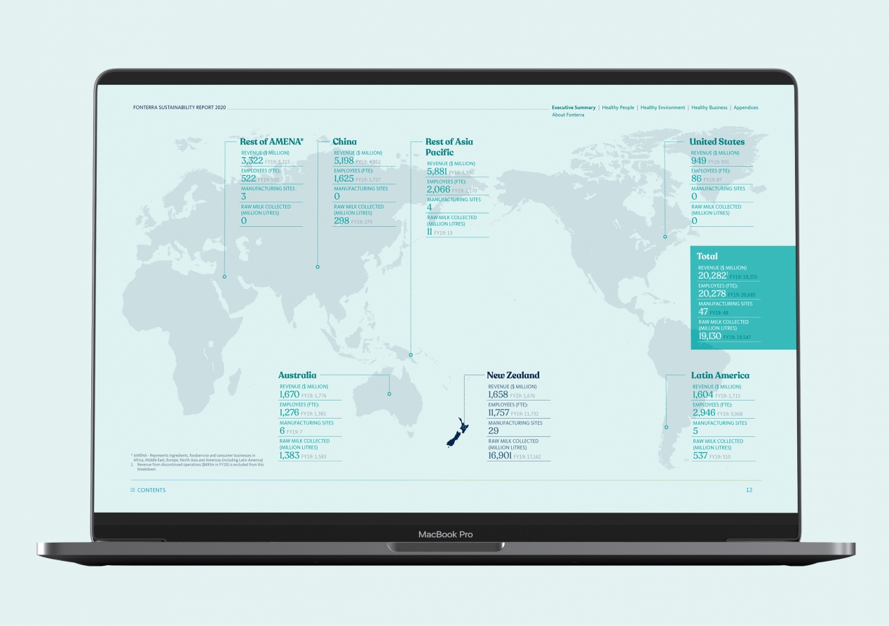
Given the constraints, we elected a heavily interactive pdf format, designing each page in a screen-oriented 16:9 form. This demanded a suite of UX and UI considerations from navigation to type size through to user flow. Clear navigation clues and hyperlinks enable viewers to quickly find information on their areas of interest and signal a message of connectivity and strategic alignment as one digs deeper into the report’s layers of evidence and transparency.
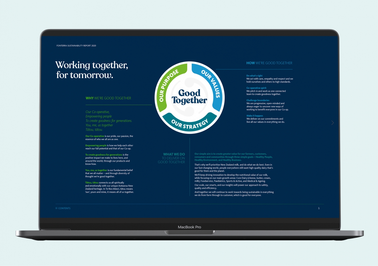
The design feels firmly a close cousin of the Fonterra annual report, while clearly establishing it’s exploration of specifically non-financial aspects of Fonterra’s business. With that connection in mind, we stayed with the annual’s theme of ‘Good Together’ and drilled a bit deeper into an aspect of their purpose: tātou, tātou (meaning ‘our’, yours and mine in Te Reo Māori).
The Results
What’s nice about a digital report is that we can pull good user analysis data. Within the first month of publication, the data revealed over 3800 views, 1640 readers, a nine minute average reading time (quite unusual for web format), all captivating 565 hours of total reading time. These are affirming numbers for an online report, sustainability or otherwise.
We’ve already commenced discussions for next year’s report, as Fonterra moves further along the journey towards integrated reporting.
