Encourage conversation
Client: Citizens Advice Bureau

If you need to know about a point of local government law or your rights regarding tree trimming where do you go and who can you ask?
For over 43 years the Citizens Advice Bureau has run a national network of largely volunteers to help every day New Zealanders sole problems.
Our task was to create a brand identity that retained their heritage yet spoke to a rapidly changing 'information age' that utilised online and offline brand experiences.
The Brief
The Citizens Advice Bureau's (CAB) roots are in wartime Britain, set up to help people cope with the dislocation, trauma and complexities of war. The New Zealand version opened its doors in Auckland in 1970 and today has a national footprint in 91 communities around New Zealand helping people learn about their rights and obligations and how best to use this to good effect to get the best outcomes.
CAB are a not for profit organisation and rely on a number of income sources including government funding and grants. In 2007 CAB embarked on a digital strategy and secured funding to develop their online presence and capitalised on the opportunity to refresh their brand identity in 2010.
The existing identity had evolved over the years and didn't have the flexibility to reflect their core proposition or have the tools to speak relevantly to its many audiences. It lacked a clear focus and purpose and was subject to local interpretations.
The Solution
Our approach was to first gain a clear and sound understanding of CAB through various focus groups and working closely with CEO Kerry Dalton. Her insights into the future direction of CAB and clear appreciation of the sensitivities of running this largely volunteer organisation were invaluable. We discovered that there was a clear disconnect between perceptions of CAB, from "not sure they could help me with this problem" to "they are a rich source of local and national knowledge across a wide spectrum of subjects either at your fingertips on line or in person in your community".
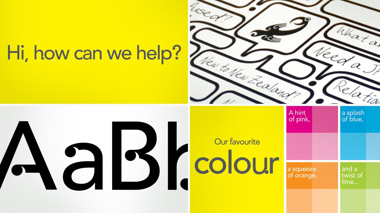
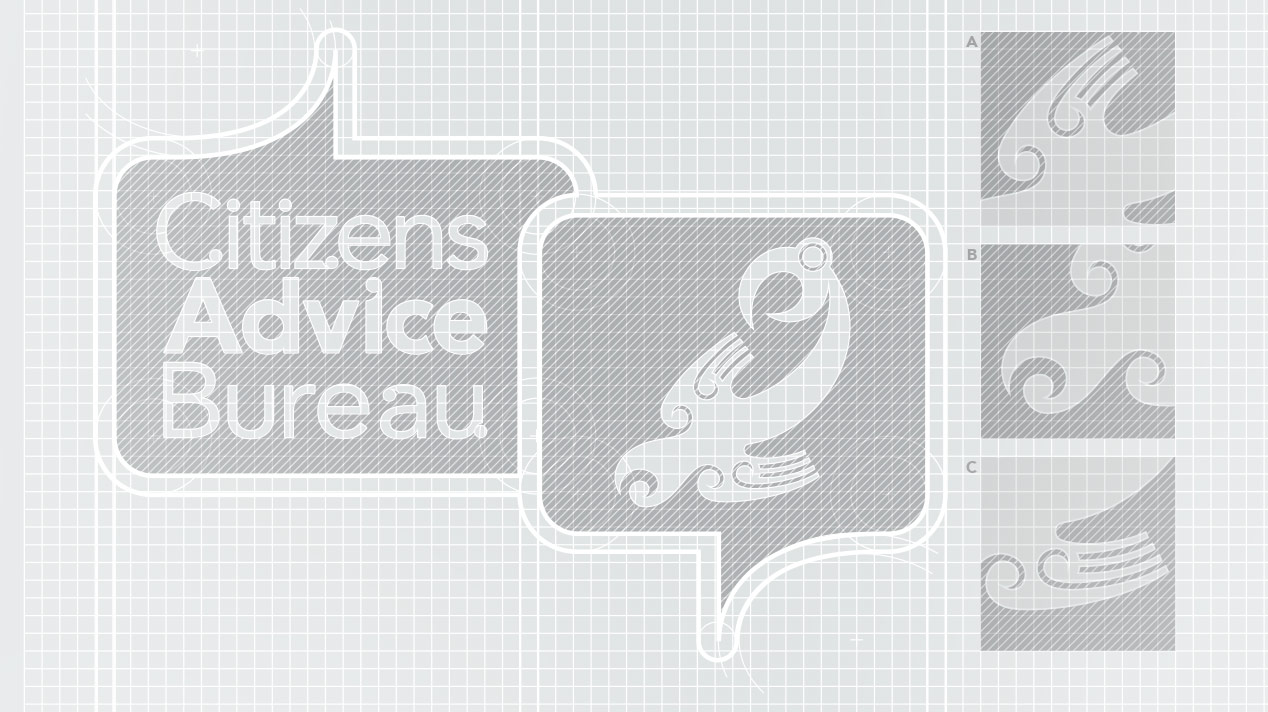
We developed a solid and consolidated visual brand identity. Centred on creating gravitas around CAB's mana (originally created by artist Don Solomon), this was redrawn and encapsulated within one of the two speech bubbles that form the logo.
We created a strong and single-minded focus around the use of yellow across all touch-points with a 'vibrant secondary colour palette' that could be used to help with online navigation without dominating the yellow.
The decision to design a new typeface as a cost effective visual 'ownership' of messaging and communications gave CAB something uniquely theirs and draw a closer appreciation that they are a local New Zealand entity.


