Or to put it another way, do we stay in a print mentality or shift to thinking ‘digital-first’?
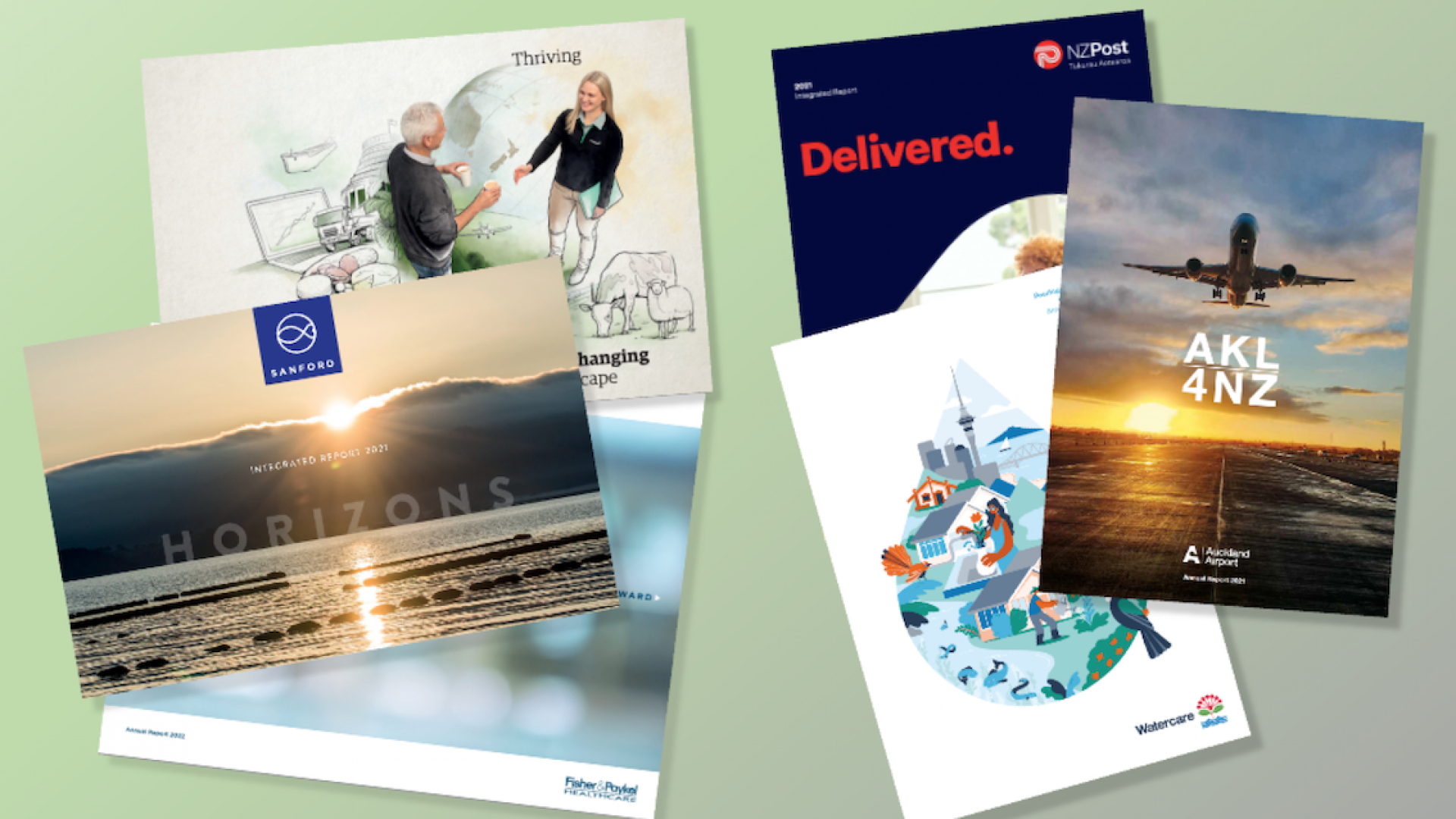
Although the forward thinkers led the way last year, this year we’ve noticed a veritable stampede. So far, our clients who have or are contemplating the move include Sanford, Fonterra, Fisher&Paykel Healthcare, Genesis, NZ Post and Ravensdown. Others we are aware of on the NZX that have already made the move are Mercury, Meridian, Contact Energy and Goodman Property.
I judge the New York-based ARC Awards each year, and while I see a smattering of landscape-oriented reports each year, it’s very clear it’s not a trend that is ruffling global markets the same way it is in New Zealand.
Pros and Cons
Like everything, there are two sides to this story. The reason our clients who are making the switch are positing is that as print numbers and readership plummet and the majority of readership is now online, the traditional A4 portrait format simply does not make for a user-friendly onscreen viewing experience. A vertical format on a horizontal screen just reduces the size of the type. Saving your pdf as spreads does ensure that the integrity of the print design is maintained and at least fills the screen, but the type is still reduced from that of a print document depending on the size of your monitor.
But making the most of the onscreen, digital-first format does require some changes to design thinking. First is the need to think in single pages rather than double page spreads. Then comes type point size. For optimum screen viewing, type needs to be larger. And that has ramifications for word count per page and subsequently to overall page count. This latter point may not make so much difference for a digital document, but chances are that you’re printing a few as well, so page numbers may need to be kept in mind. And even if you’re designing as single pages, if you are still printing any, how those pages look and work as spreads still needs to be catered for. And make sure you think through what all this might mean for your financial tables!
Further consequences of fitting less content on a page is that it can become harder to present a comprehensive and connected case if that case’s arguments can’t readily be grasped in their totality.
And it’s harder to get a strong brand personality across when the layout is dictated more by practicality than by visual brand cues, as by nature of the medium the layout leads to a more template-looking approach.
On the other hand, one of the shortcomings of a printed report is its inability to easily link to associated or related streams of information. With the click-navigation afforded by a well hyperlinked pdf, following links and moving from topic to topic becomes so much more fluid. And of course, a click can activate a short video or explainer animation that can really bring your communication to active life.
A final benefit that comes to mind is, having made the switch, do you need to bother about a separate microsite for delivering your report online? Can your screen-optimised pdf do the job effectively?
Digging deeper
As we move more of our clients to the landscape format, further considerations come into play. Do we stay with A4 sizing? Or do we tweak that page ratio to more of a screen optimised dimension – say 16:9? And what ramification does that have for print?
While it feels like a tipping point is getting closer, it’s still not a decision that can be made without considerable forethought as to what it can mean in practice, in briefing, in nutting out your report structure and story arc, thinking in digital 3-dimensions in terms of hyperlinking – and whether your appointed designers are equipped for the different way of thinking required.

