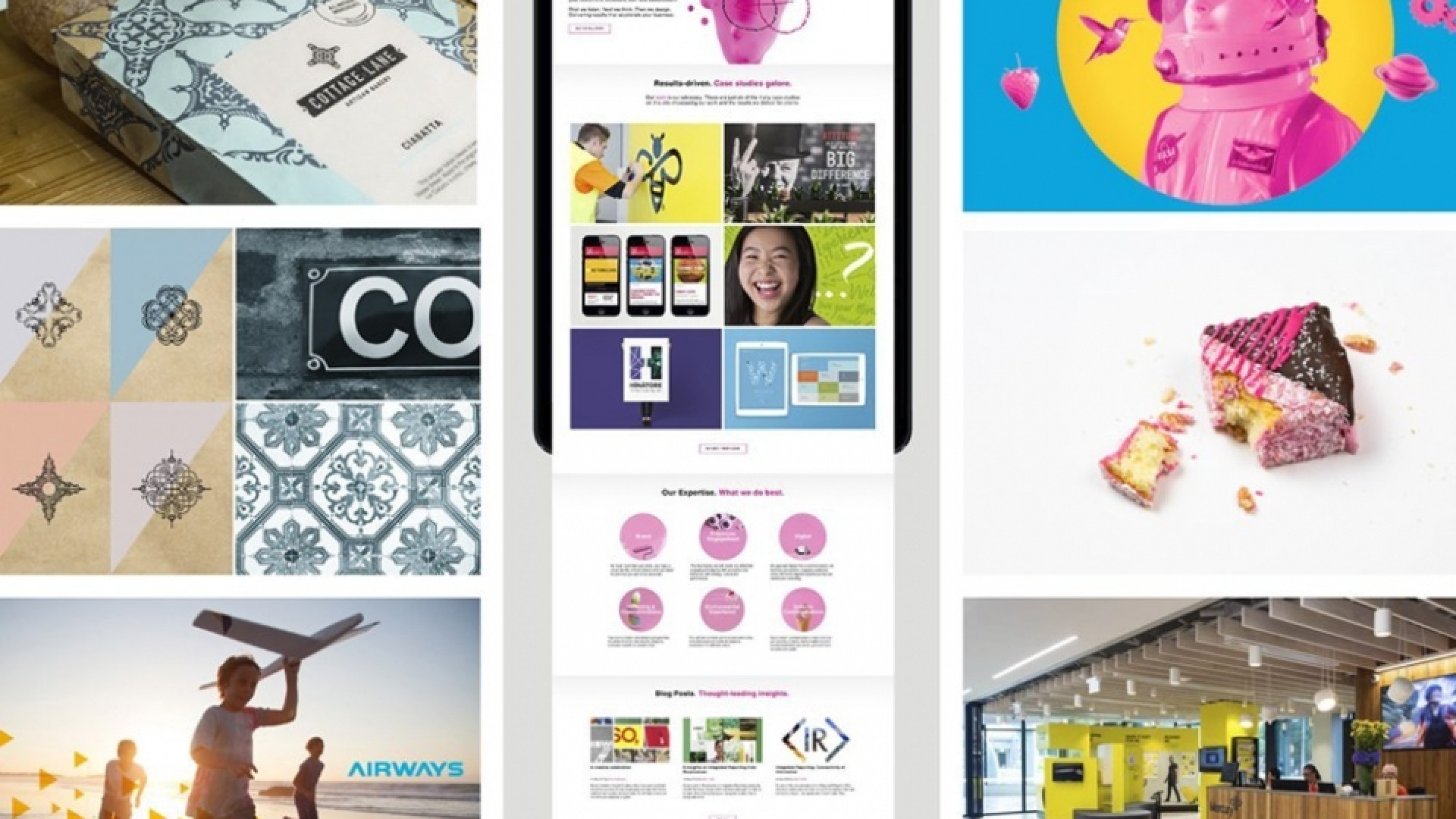
Continuing this new series, where we stop occasionally and take some time to celebrate our creative achievements. This week, I've focused around the theme ‘great ideas’. It was great to see a wide variety of work coming through from the past 12 months. Clear, strategic thinking helped to solve and navigate complex briefs. All projects chosen were excellent examples of how balancing strategy and design is essential to communicate a ‘great idea’.

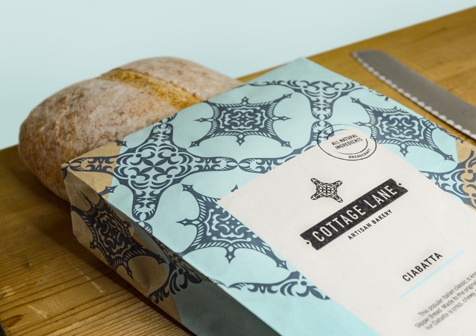
Breadcraft – Cottage Lane
Simplicity is a great idea.
As designers we can quite often get carried away with details and seduced by the unnecessary – confusing what is trying to be communicated. The Cottage Lane logo is a good example of a good idea simplified. With the name at the core of the idea, it is presented as an elementary laneway sign, using classic street-sign typography and a recognisable street-sign shape. You get it, a nod to classic European street experience, the cafés, the food, all echoed too in the packaging through the traditional ‘naked’ presentation of the fresh product.
— Chris Gough Palmer

Airways brand
The big idea behind Airways branding is a “Going Beyond” story to define the essence of the brand. It expresses the role of Airways in the modern era, doing more than just guiding planes to land safely. With a customer first ethos, and using cutting edge technology to deliver beneficial outcomes. I love this idea because it’s dynamic and exciting; there is always more to be discovered, implemented, and delivered to their customers. The visual identity that followed expressed that story. Triangles facing forward and up express the forward motion and innovation, generous tracking in heading type treatment creates a sense of space and energy, combined with a bright and bold colour palette and future focused, fresh imagery, creates a compelling and forward thinking identity.
— Anna Charlett

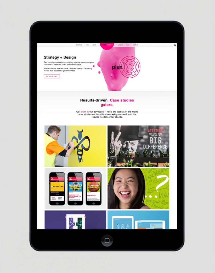
Insight’s new website
I think it was a great idea to put energy into refreshing and updating the Insight website. As a design agency I think it is really important for anything created that represents ‘us’ to be at the same level as something we would create for our clients. After all, it’s generally the first piece of work clients will see.
— Alice McKeown

Insight’s AR Wall (featured in Insight’s offices)
There are so many exciting layers of thinking within this project. I think it’s a really smart idea to capture our vast range of capabilities in a piece of technology that we can show to clients and help them understand and buy into AR. It successfully represents what Insight stands for as a business. A true result of learning, pushing the boundaries and collaborating as a team.
— Jo Ross

Mashmaster’s Mallington - Insight's end of year Christmas gift
The Mallington. This baked goodie not only supported the ‘big idea’ behind the gift it was a part of (two complementary forces coming together to create a better end result), but was delicious enough for both eyes and tongue that one of our clients is getting it re-made for her wedding! It shows that not all ‘design’ ends up printed on a piece of paper, or formed in pixels on a website.
— Sarah Turner

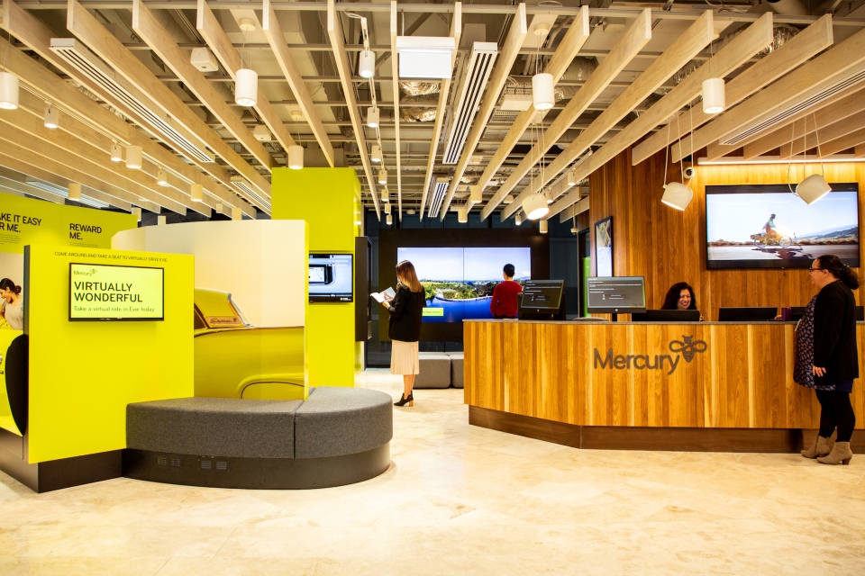
Mercury Showcase
This project was so deserving in recognition across the whole of company. From the initiative to invest in the project, used as a testing ground and the ongoing development of strategic creative idea generation. I think it’s lifted us all to another level of expectation.
— Brian Slade

